PACKAGING DESIGN
UnHinged
The brand name, product concept, and an early box dieline were supplied by the client. I developed the finished visual system, all Nutrition Facts and compliance copy, and the individual bar wrapper, which did not exist as finished art before this project.
Deliverables
Wrapper + Box Design
SCOPE
Packaging Design
FORMAT
Custom Dieline
3D Renders
PRODUCT
Protein Energy Bar
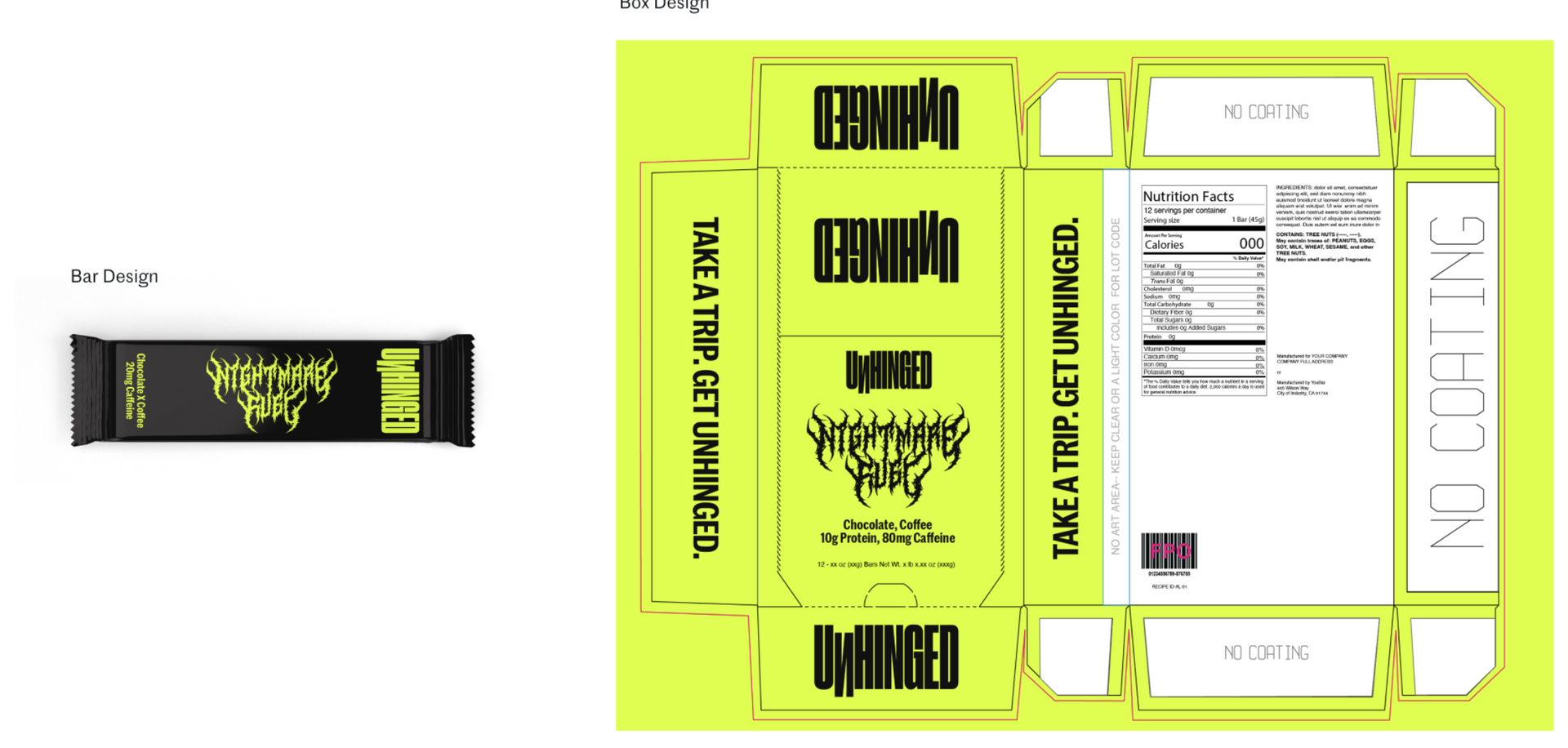
UNHINGED is a functional snack brand built on blunt, high-energy positioning: bars loaded with protein, caffeine, and fiber for people who need to push through their day. Nightmare Fuel, the chocolate coffee flavor, was already named and formulated by the time the project reached me. What I received wasn’t a finished package. It was a working box dieline carrying a placeholder gothic-metal “Nightmare Fuel” mark, an unresolved black-and-lime color story, and blank Nutrition Facts and ingredient panels. The individual bar wrapper existed only as a generic template dieline stamped “Take a Trip. Get Unhinged.,” with a mockup slug sitting where finished art should have been.
My job was to take both files to production: a print-ready 12-count carton and, for the first time, a matching single-serve wrapper the client could run with.
Overview
The Brief
DESIGN STRATEGY
Three Pillars
01
Shelf Cohesion
The bar and the box needed to read as the same product whether a shopper saw the carton on shelf or pulled a single bar out of a gym bag. Nothing in the original files connected the two beyond the product name.
02
Tone Control
The placeholder gothic mark leaned harder into “metal” than the brand’s actual voice, which is confident and sardonic rather than aggressive. I needed a wordmark that could carry “Get Sh*t Done.” without reading like a death metal logo.
03
Production Readiness
Both dielines had blank compliance panels. Nutrition Facts, ingredient statements, allergen disclosures, and manufacturer information all had to be finished, checked, and placed correctly before either file could go to press.
VISUAL IDENTITY
Color + Type
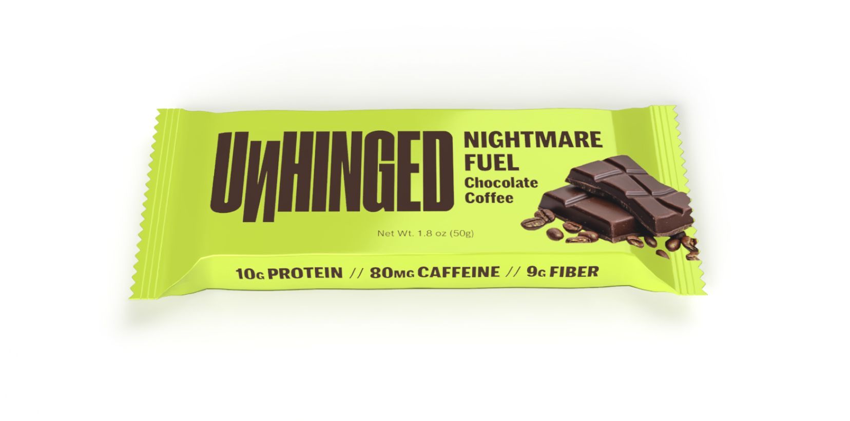
I moved the palette off the placeholder black-and-lime combination and onto a warmer pairing: a bright lime ground with a deep espresso brown carrying the wordmark, headlines, and body copy. Real product photography, a broken chocolate bar next to loose coffee beans, replaced the flat color block on both the box and the wrapper, giving the flavor story something to point to besides the name. For the wordmark, I replaced the placeholder gothic display face with a heavy, condensed geometric sans. It needed to hold its attitude at carton scale and still read clean shrunk down to fit a wrapper a fraction of that size, so I kept the letterforms blunt and simple rather than ornamented. Nutrition data and functional callouts run in a clean grotesque for legibility against the more expressive display type.
Neon Lime
#e1fe52
Espresso Brown
#4c3329
MARR SANS
The primary display typeface. Ultra-condensed, all-caps for headlines, with title case used for subheadlines.
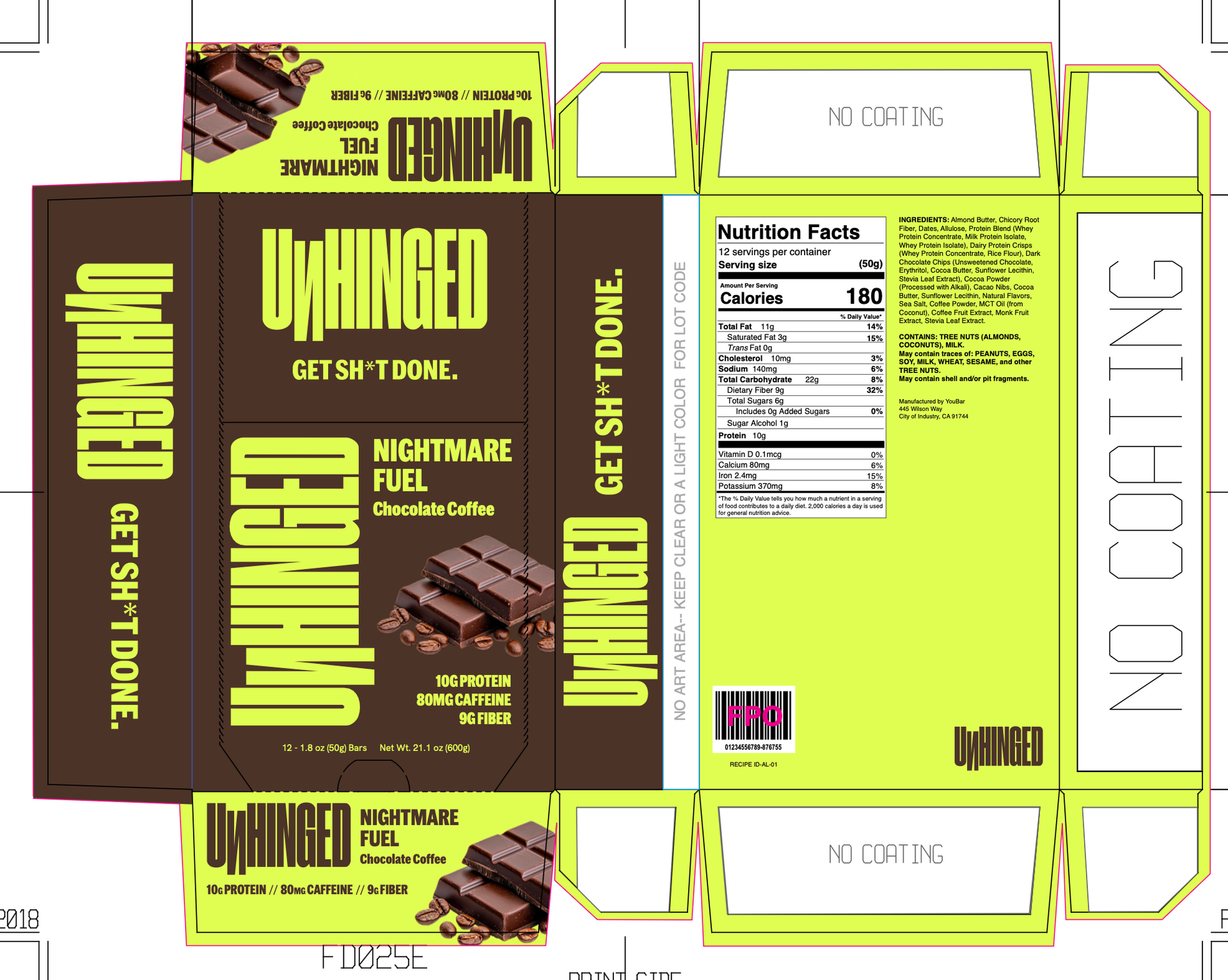
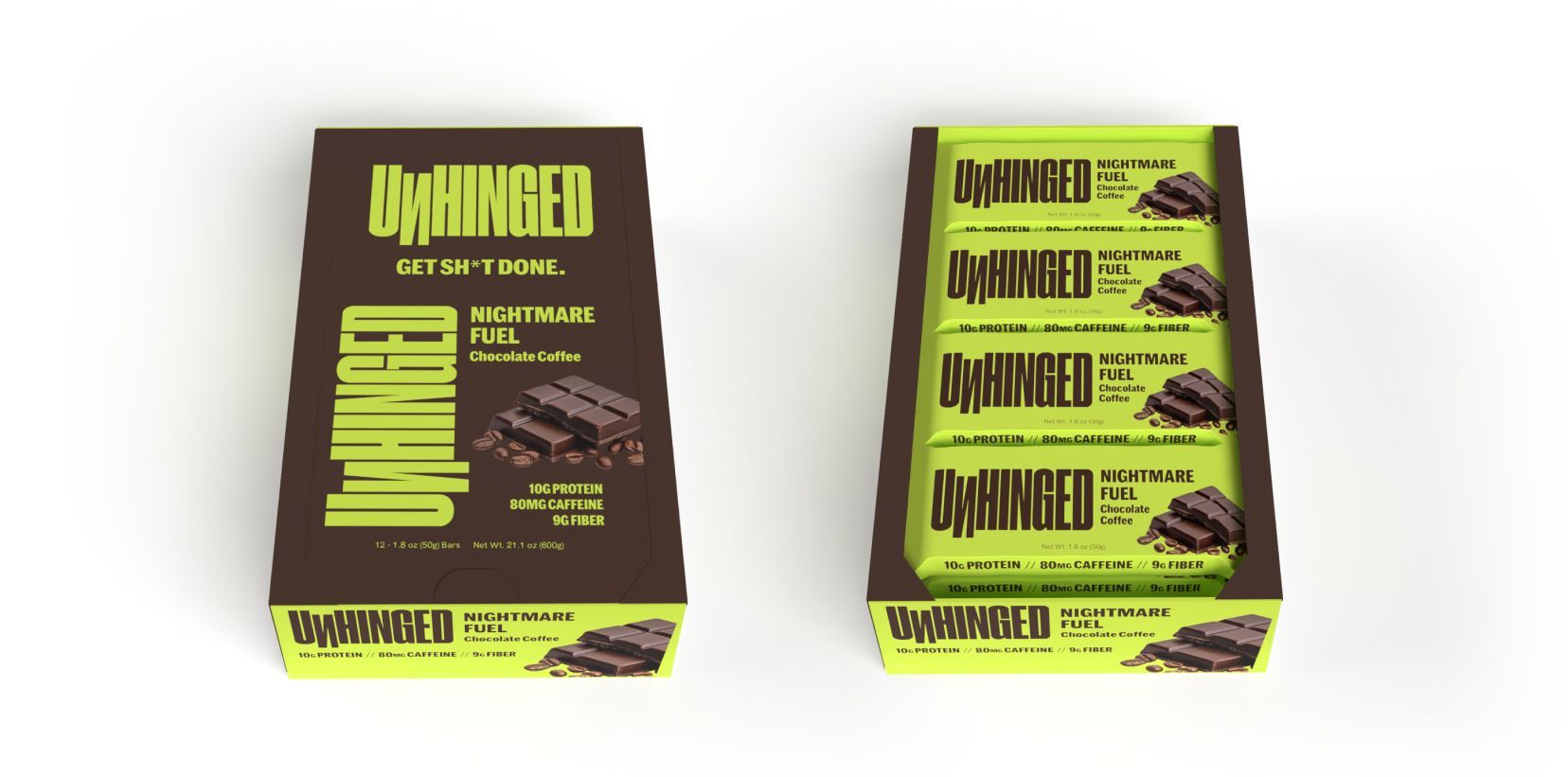
On the carton, the front panel carries the wordmark, the Nightmare Fuel flavor lockup, and the net weight over the product photography. The top and bottom tuck panels repeat the flavor lockup and the three functional callouts, protein, caffeine, and fiber, so they read correctly no matter which way the box sits on shelf. One side panel holds the finished Nutrition Facts, ingredient statement, and allergen
disclosures; the other carries manufacturer information and barcode placement. The back panel mirrors the front branding so the product reads the same from either facing.
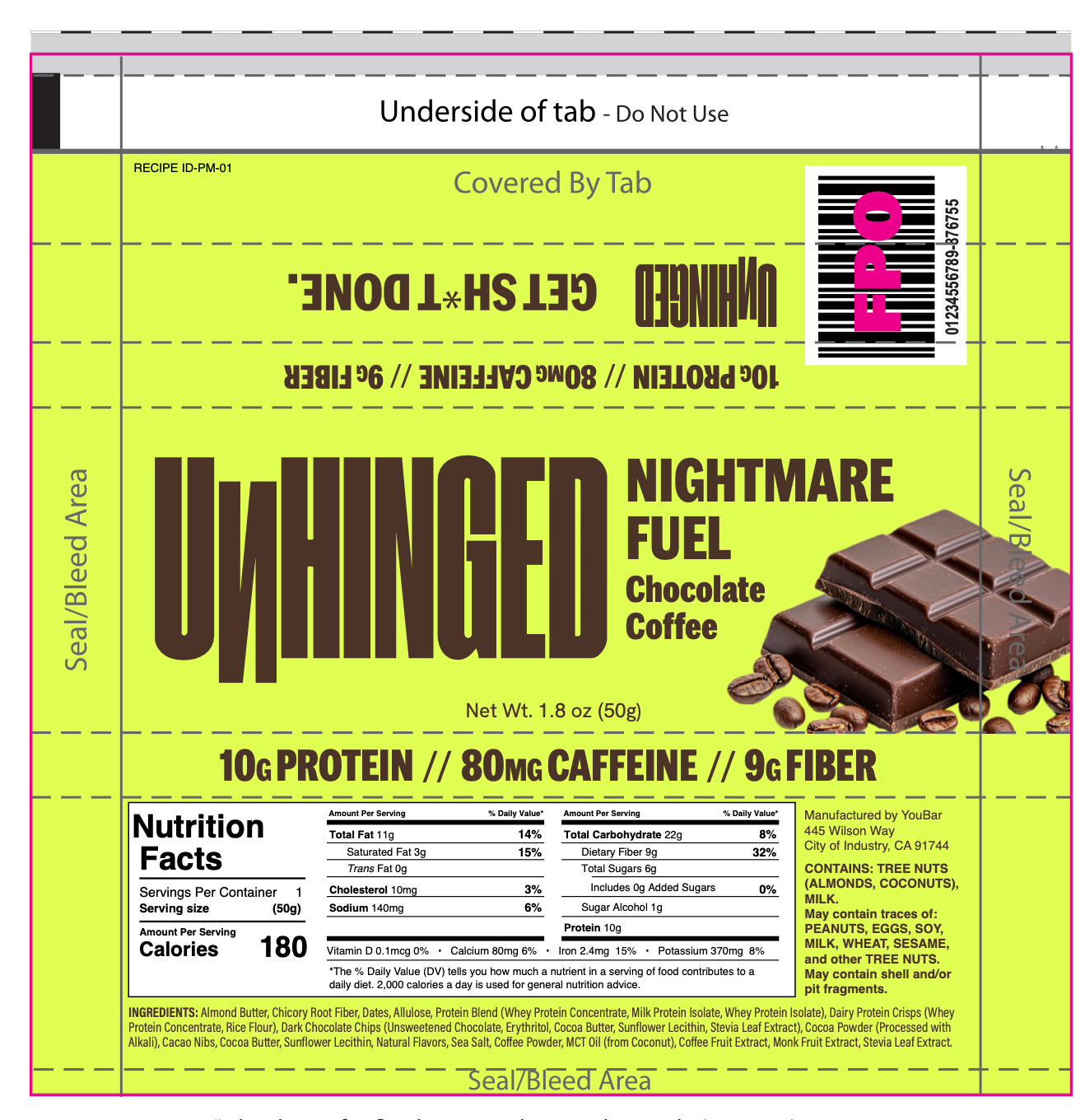
The wrapper compresses that same hierarchy onto roughly a tenth of the carton’s surface area:
wordmark, flavor name, functional callouts, and net weight on the front, with a scaled-down Nutrition
Facts and ingredient panel on the back built to the same legibility standard as the carton. Nothing on
the wrapper is a shrunken version of the box copy; every panel was rebuilt for its own format.
structural design
Panel-by-Panel
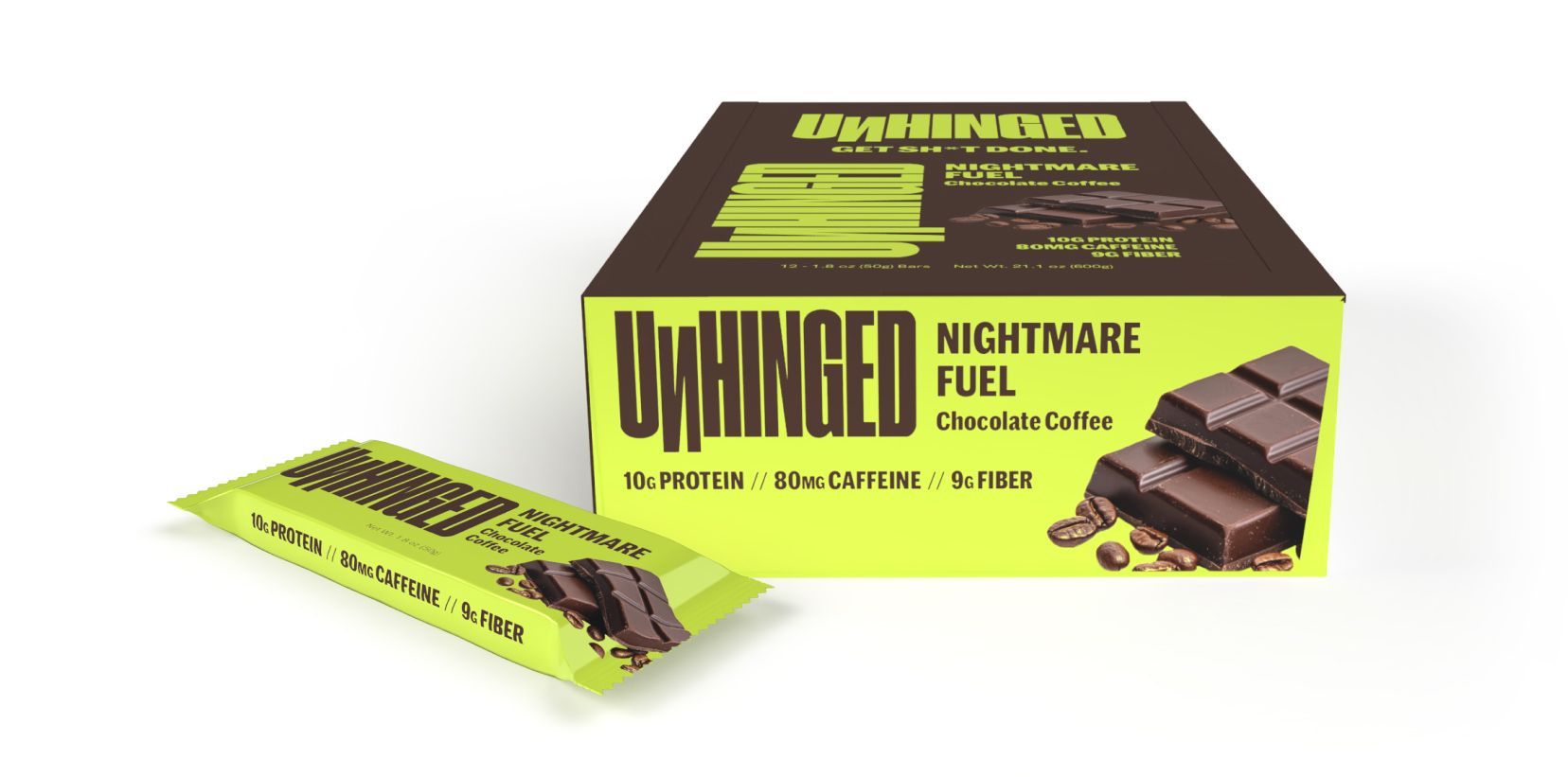
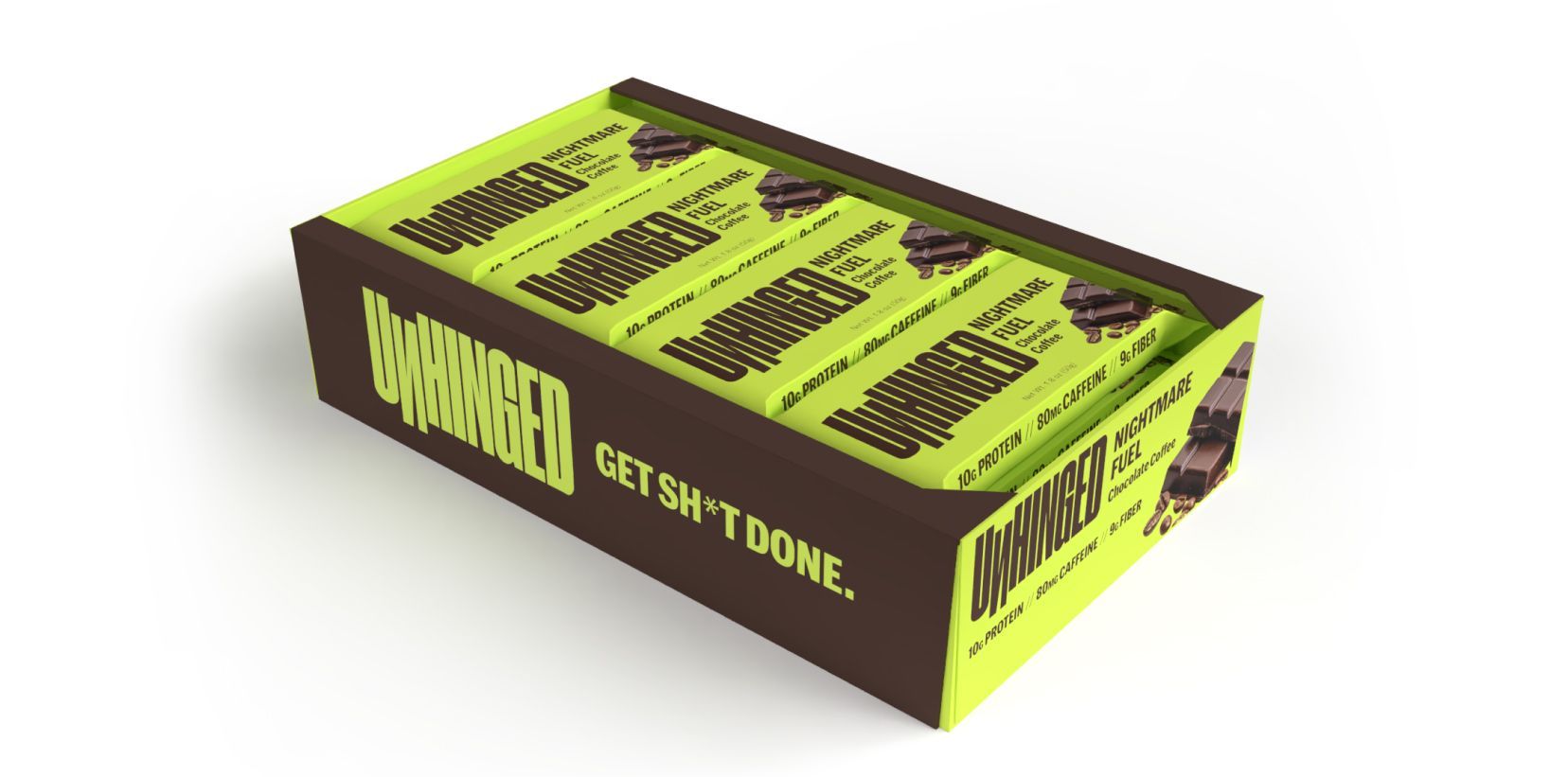
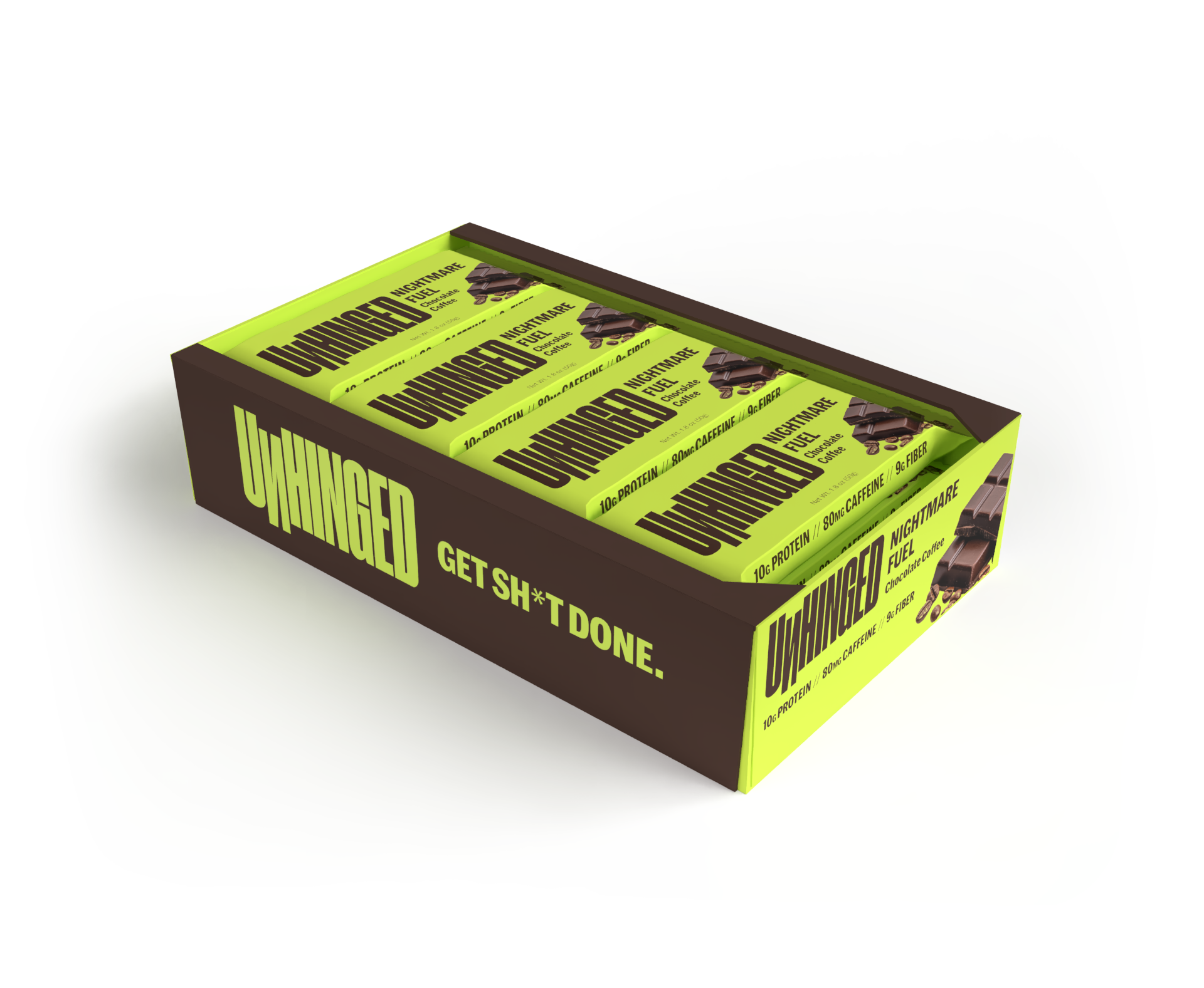
The design was developed simultaneously as a production-ready flat dieline and a 3D render suite. This dual-format delivery allowed the client to use renders immediately for e-commerce listings, pitch decks, and social content without waiting for physical samples.
The 3D renders were produced at multiple angles: front/back isolated, three-quarter with product visible through the window, and dynamic perspective shots against the lime background. This gave the brand a full creative asset library on day one.
execution
Dieline to 3D
The client now has a single visual system instead of one finished file and one placeholder. The box and the wrapper read as the same product at every size, which the original files couldn’t do since only the carton had real design behind it. Just as importantly, the client can now sell Nightmare Fuel as a standalone bar, not only inside a 12-count case, because the wrapper is production art instead of a mockup template.
The heavier, more condensed wordmark also gives the brand something to build future flavors on: a mark confident enough to hold its own at wrapper scale, which the original gothic treatment couldn’t manage.
OUTCOMES
What Was Delivered