PACKAGING DESIGN
ShotStacks
A complete retail packaging system for a stackable, reusable shot glass brand — built for shelf impact, utility communication, and outdoor lifestyle appeal.
Deliverables
D2C + Retail Box
SCOPE
Packaging Design
FORMAT
Custom Dieline
3D Renders
PRODUCT
3-Pack Shot Glasses
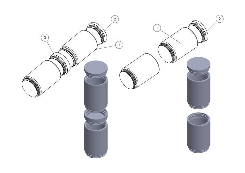
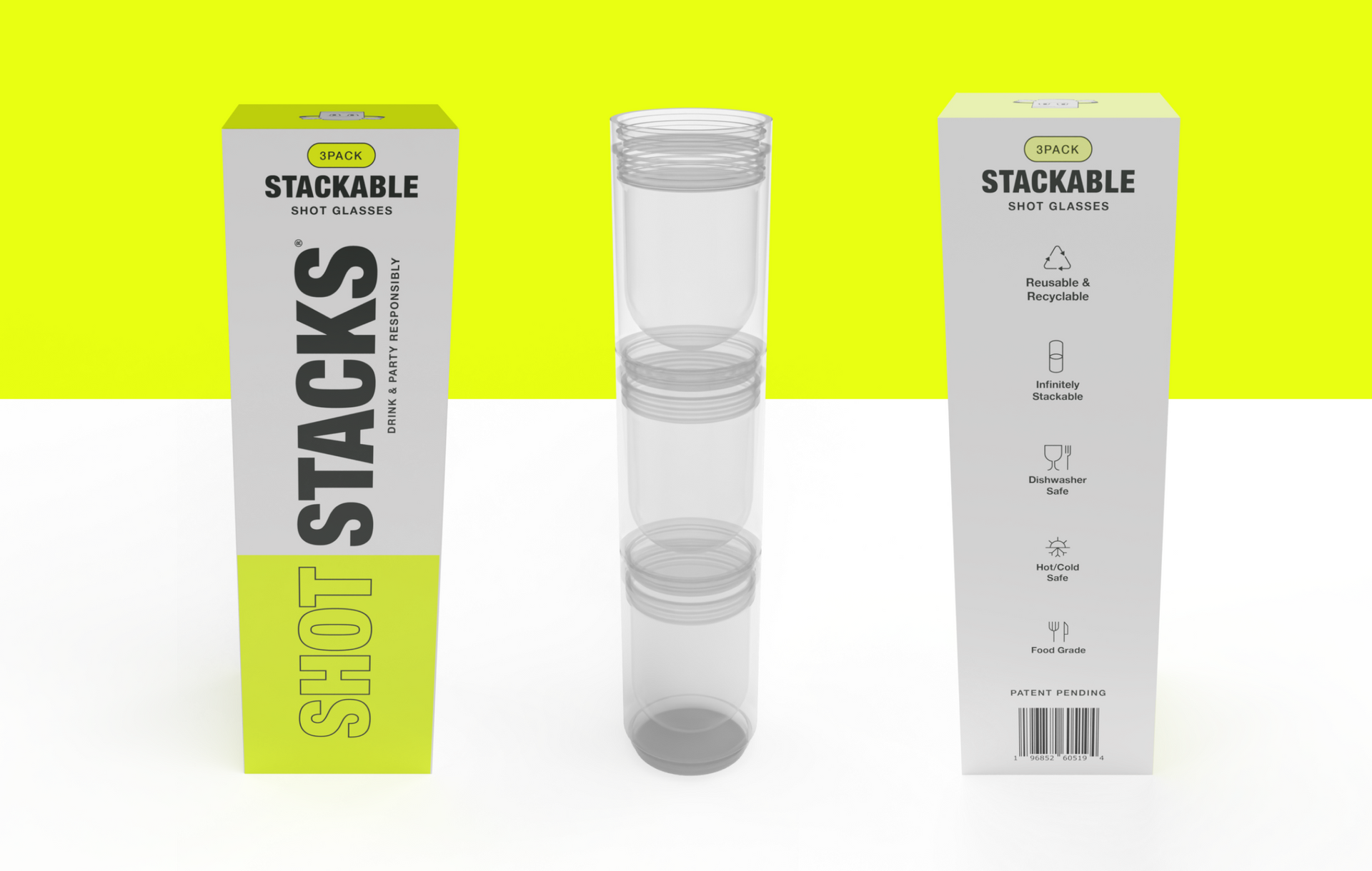
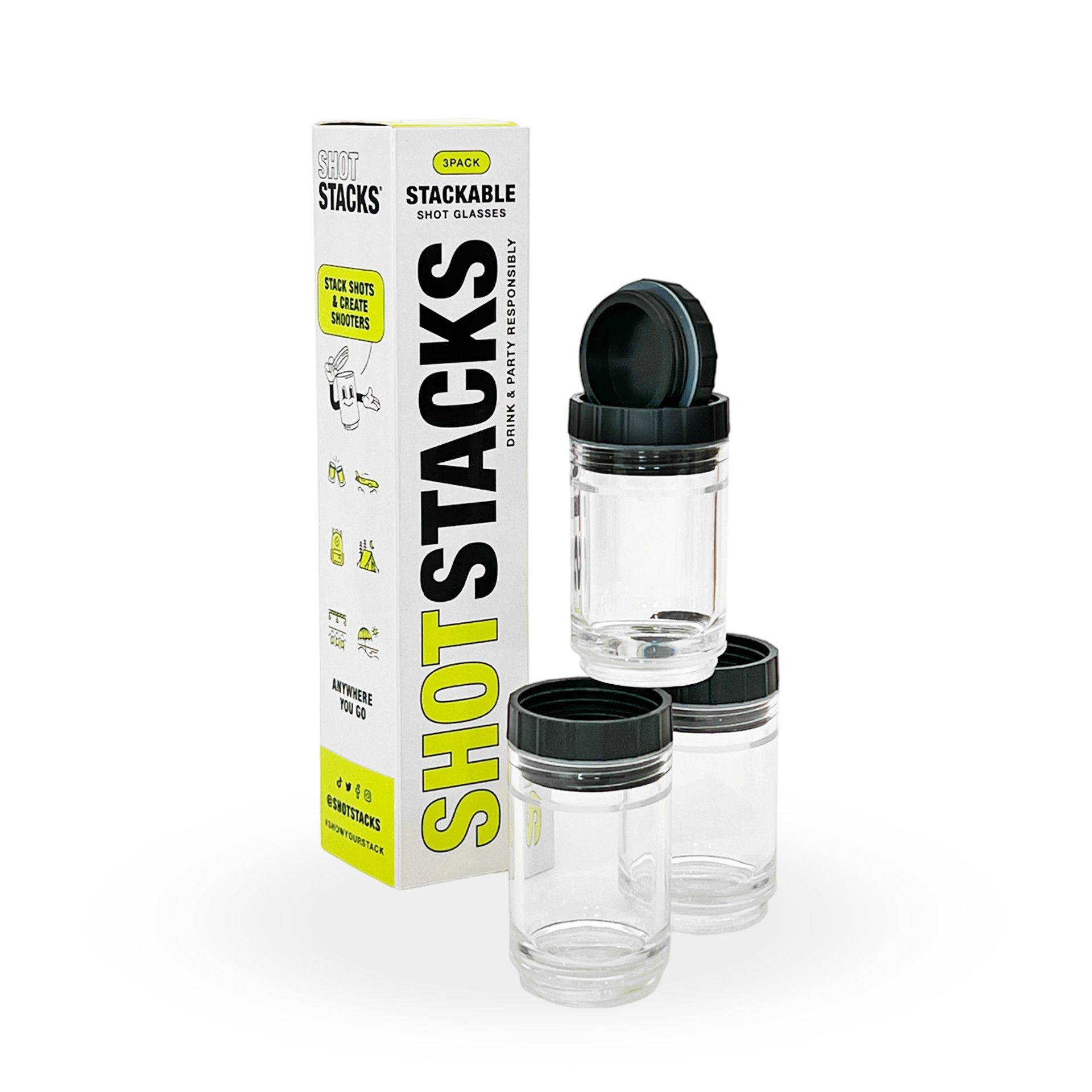
Shot Stacks came to market with an inventive product, a liquid-tight, threaded shot glass that screws together with others to form a portable shooter tower. The challenge? Design packaging that immediately communicates what the product does, conveys its key utility features, and stands out in both digital and retail environments.
The packaging had to do heavy lifting: hero the product through a window, explain the stacking mechanism, list functional specs, showcase lifestyle use cases, and carry a brand personality that was bold, fun, and outdoors-ready — all across a narrow 6-panel box.
Overview
The Brief
"Stack shots & create shooters — anywhere you go." The core message shaped every design decision: this product lives at parties, campsites, tailgates, and festivals. The packaging needed to feel like it belonged there.
DESIGN STRATEGY
Three Pillars
01
Instant Recognition
Electric lime + bold type ensures shelf standout. The word mark wraps vertically to maximize brand surface area on all faces.
02
Utility Clarity
Icon-driven feature callouts — stackable, dishwasher safe, hot/cold, food grade — communicate specs at a glance without dense text.
03
Lifestyle Story
Illustrated scene icons (camping, beach, festivals, sports) and the "Anywhere You Go" panel anchor the brand in outdoor adventure culture.
VISUAL IDENTITY
Color + Type
The palette is deliberately minimal: a two-color system of electric lime and near-black on white. This avoids the premium darkness of spirits packaging and instead signals energy, approachability, and fun. The lime reads well at distance and photographs powerfully for social media.
Electric Lime
#C8F135
Near Black
#1A1A1A
Off White
#F5F5F2
Bebas Neue
The primary display typeface. Ultra-condensed, all-caps, and high-impact. Used for brand name, section headers, and the oversized "SHOT" lockup that wraps vertically across the side panel. Creates visual tension with the clean white space around it.
Helvetica Neue
Used for body copy, feature callouts, and instructional text. Keeps utility information readable and distinct from the display headlines.
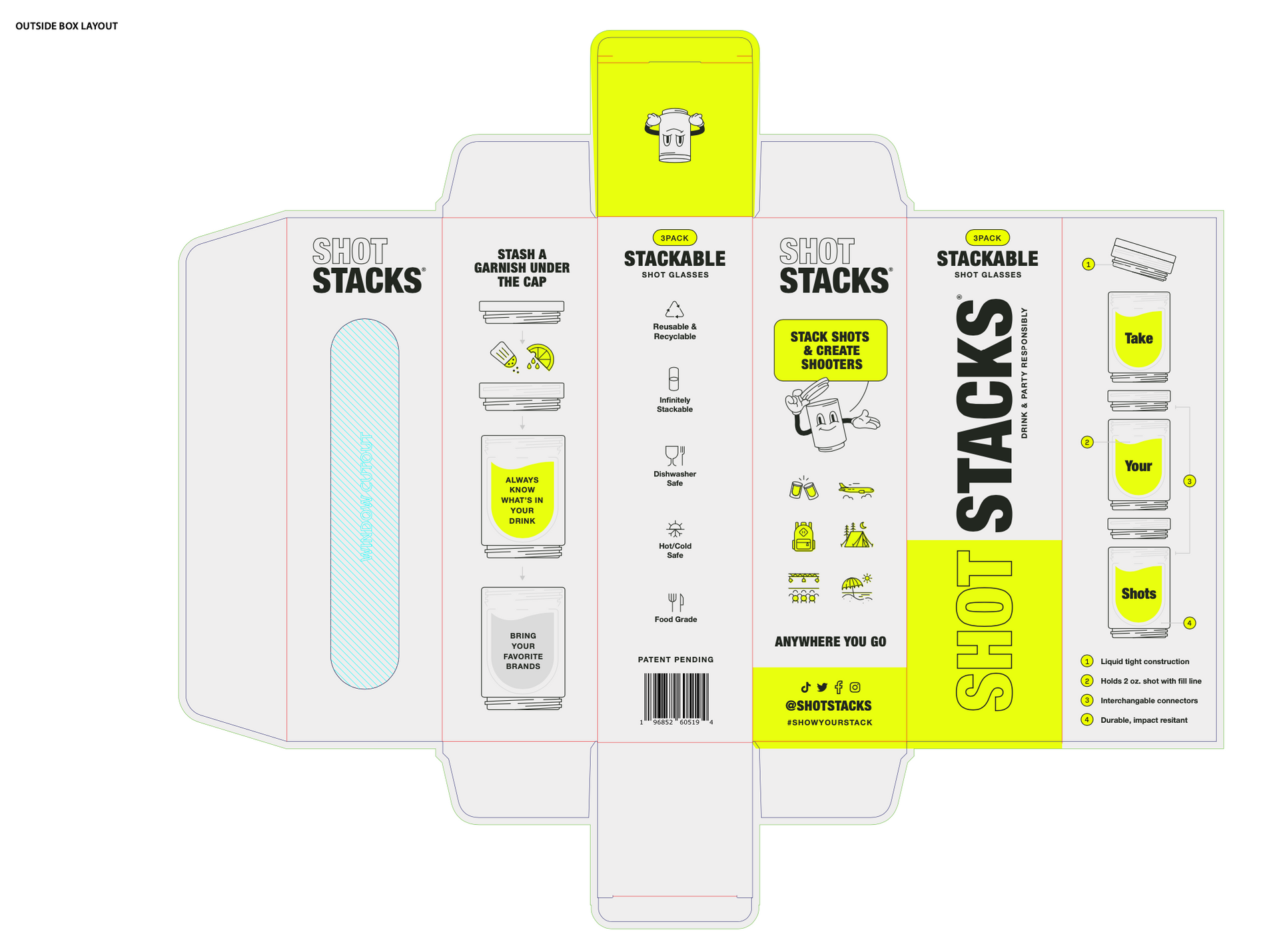
The dieline assigns a clear job to each of the six panels, preventing the common mistake of repeating the same information across surfaces. Every face rewards the shopper at a different stage of their interaction with the box.
structural design
Panel-by-Panel
Inner Front
Left side panel
The outer panel opens to reveal an the "SHOT STACKS®" wordmark with a clear window displaying the product.
Outer Front Flap
Oversized vertical "SHOT STACKS®" wordmark with "Drink & Party Responsibly" running perpendicular — bold typographic moment, high visibility on shelf display racks.
Inner Front Flap
"Take Your Shots" step diagram with numbered callouts (1–4) illustrating the liquid-tight cap system, 2oz fill line, interchangeable connectors, and impact resistance.
Right Panel
"Stash a Garnish Under the Cap" instructional panel with step illustration — a clever use of typically wasted inner packaging space to add brand delight post-purchase.
Left Panel
"Shot Stacks" wordmark, "Stack Shots & Create Shooters" hero callout in lime badge, illustrated mascot character, and lifestyle use-case icons. Window cut-out lets the product itself speak.
Back Panel
Feature specification list with custom icons: Reusable & Recyclable, Infinitely Stackable, Dishwasher Safe, Hot/Cold Safe, Food Grade. Barcode and Patent Pending notice. Clean, informational, retail-compliant.

The design was developed simultaneously as a production-ready flat dieline and a 3D render suite. This dual-format delivery allowed the client to use renders immediately for e-commerce listings, pitch decks, and social content without waiting for physical samples.
The 3D renders were produced at multiple angles: front/back isolated, three-quarter with product visible through the window, and dynamic perspective shots against the lime background. This gave the brand a full creative asset library on day one.
execution
Dieline to 3D
The final system included a production-ready dieline file, full 3D render suite, social media open graph assets, and a scalable visual language that can extend to future SKUs (6-pack, licensed editions, additional colorways) without redesigning from scratch.
OUTCOMES
What Was Delivered