
PACKAGING DESIGN
SereneScent
A system-wide packaging overhaul that solved a multi-SKU color problem and elevated Homedics to a premium wellness shelf presence.
ROLE
Senior Packaging Designer
SCOPE
SereneScent D2C Packaging
RETAILERS
Amazon
PRODUCT
Folding Boxes
Homedics was launching SereneScent, a premium home fragrance sub-brand, directly into the D2C and Amazon marketplace, a channel that typically flattens brand equity. The challenge: design a gift-worthy unboxing experience that would compete with prestige fragrance names, without a prestige price point in production costs.
The packaging needed to do two things simultaneously, communicate restraint and luxury on the outside, and deliver an emotional reveal on the inside that earns the social share and repeat purchase.
Overview
The Brief
The box had to feel like a gift the customer gave themselves, before they even opened it.

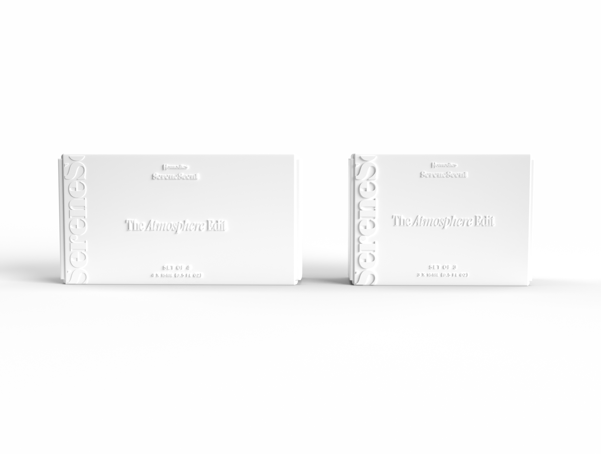
Early concepting explored how substrate choice alone could signal brand position. Three colorways were developed at identical die-line and typography to isolate material as the variable:
- White Soft Touch
- SereneScent Mocha
- Kraft
Each substrate carried a distinct brand read: white felt clinical-clean; mocha pushed into deep luxury territory; kraft leaned sustainable and artisan.
phase 1
Material Exploration
phase 2
Design System
The typographic system was built around a contrast pair: a bold display serif wordmark at oversized scale, cropped and embossed into the side panel as a textural background element, paired with a mixed-weight headline treatment using italic serif for product names. This kept the exterior wordmark-forward without adding color or print cost.
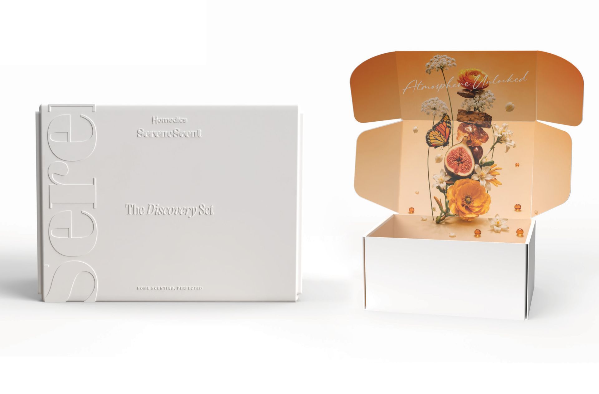
Tone-on-tone blind emboss
Rather than a second print color or foil stamp, the final design uses a tone-on-tone blind emboss across the entire exterior surface. The "SereneScent" logotype, the decorative "S" botanical motif, and the full panel side typography are all raised into the substrate with no ink, no foil. This achieves the tactile luxury of a prestige gift box at a fraction of the finishing cost, while keeping the structural form audit-ready for Amazon's ISTA 6 testing requirements.
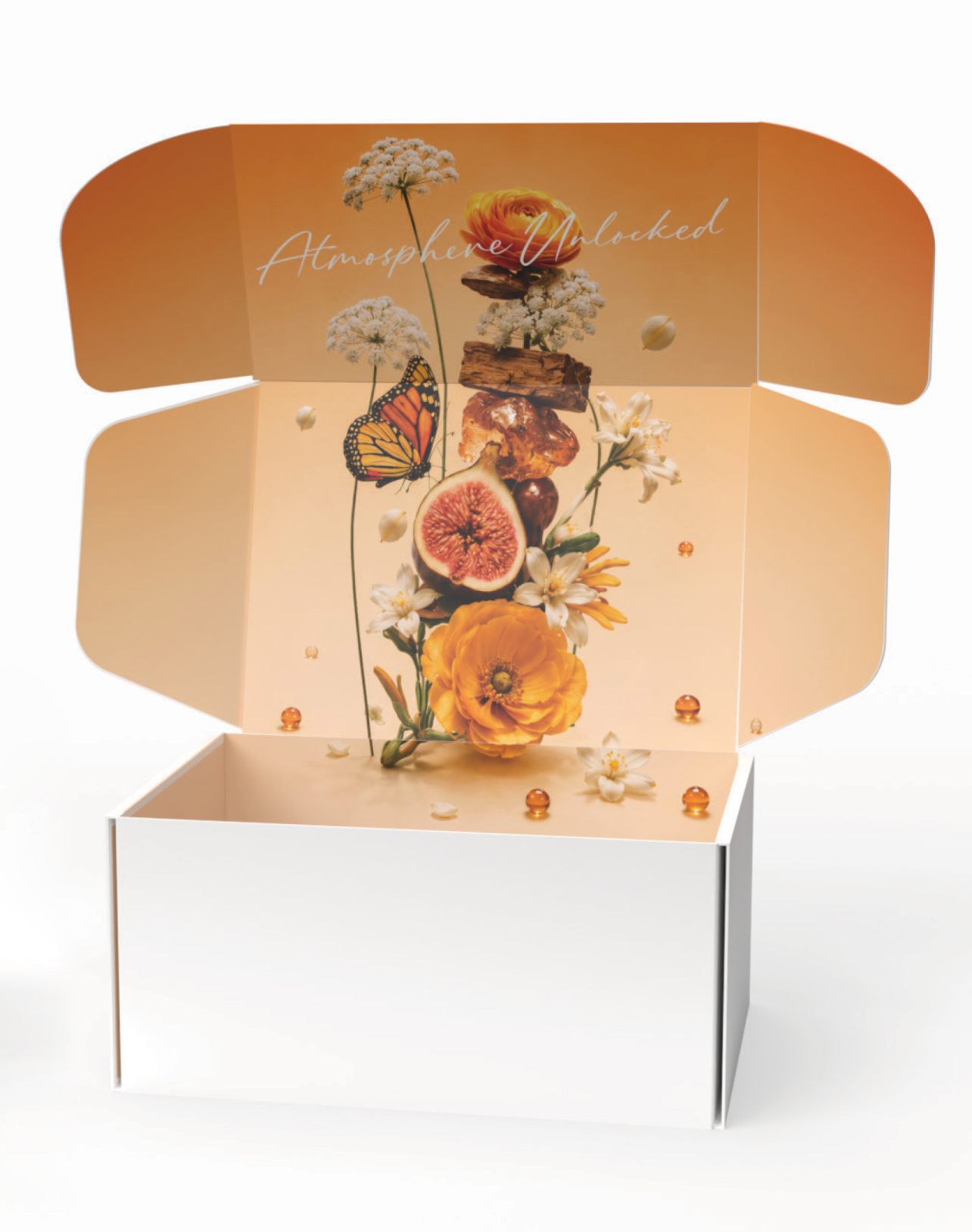
The exterior restraint was designed to make the interior reveal land harder. When the mailer opens, a full-bleed botanical illustration floods the inner panels, warm amber tones, layered florals, dried botanicals, a monarch butterfly, and the script headline Atmosphere Unlocked.
The contrast between the silent white exterior and the illustrated interior creates the gift moment the brand needed.
The illustration was built to span all four inner flap panels continuously, so the reveal unfolds progressively as the customer opens the box, rewarding the full open rather than telegraphing the surprise through a partial peek.
PHASE 3
The Unboxing Reveal
Outside: restraint. Inside: the world the fragrance lives in.