BRANDING + PACKAGING DESIGN
Kinro
A complete brand identity system and 16 oz can design for a fermented electrolyte beverage built for trail runners, ultramarathoners, and the outdoor endurance community.
Deliverables
Logo, Brand Board, Shrink Sleeve Design
SCOPE
Brand Identity System, Can Packaging, Print & 3D Files, Social Kit
FORMAT
Dieline
3D Renders
PRODUCT
Beverage, Functional CPG
KINRO came to me pre-launch: formula finalized, go-to-market defined, no existing brand assets. The engagement covered the full identity system and the packaging for the launch SKU, built from the ground up.
The product itself is a fermented electrolyte beverage for endurance athletes, made from coconut water fermented with Lactobacillus plantarum, dosed with 450mg of sodium and formulated as a hypotonic solution for faster gastric emptying mid-run. The name honors the Japanese concept of kinro, the dignity of labor and the value of showing up and putting in the work. It's not aspirational language. It's descriptive.
I worked from the client's studio brief: the name, the tagline, a working color direction, the full technical claims package, and detailed FDA labeling requirements. From there I built the logo suite, the color and type system, brand standards documentation, and the launch can, front to back, with no client-supplied visual assets to start from.
Overview
The Brief
The identity needed to hold serious performance credentials, the sodium load, the hypotonic formulation, the live cultures, and let the clean label support that story rather than headline it.
DESIGN STRATEGY
Three Pillars
01
Descriptive, Not Aspirational
KINRO doesn't celebrate achievement, it acknowledges effort. The voice is direct and honest rather than motivational: less "you've got this," more "here's what it does." That ruled out inspirational headline copy and pushed the type and layout toward something functional and matter-of-fact.
02
Performance First, Clean By Nature
The numbers lead: 450mg sodium, hypotonic formulation, L. plantarum. Fermentation and whole-food inputs are present and legible, but they support the performance story instead of fronting it. This is a serious athlete's product that happens to be clean, not a clean product that happens to work.
03
Vest Pocket, Not Shelf Bait
No mountain silhouettes, no lightning bolts, no neon, no kombucha aesthetic. The brief ruled out every athletic and wellness cliché on the table. What was left had to feel earned: earthy, matte, honest, built to survive a wet trail and a stranger's hand, not a photo shoot.
VISUAL IDENTITY
Color + Type
The client's working color direction was already close to right. I refined the values, built out the full system, and paired it with a type combination that had to read as strong and functional at both logo scale and 6-point regulatory type.
Forest Green
#2C3E2B
Primary: earthy, endurance, serious
Sage Green
#8B9D85
Secondary: natural, fermented, alive
Warm Sand
#D4C5A8
Accent: grounded, organic
Natural Cream
#FAF8F3
Background: clean, honest, nothing to hide
Campaign Light
Rounded, geometric, and functional. Reads as earthy and strong rather than tech, medical, or luxury, and holds up at logo scale on a curved can.
Manrope
Clean and legible down to FDA minimum sizes (6pt label copy, 8pt nutrition facts), which carries the ingredient statement, nutrition panel, and benefit copy on the back of the can.
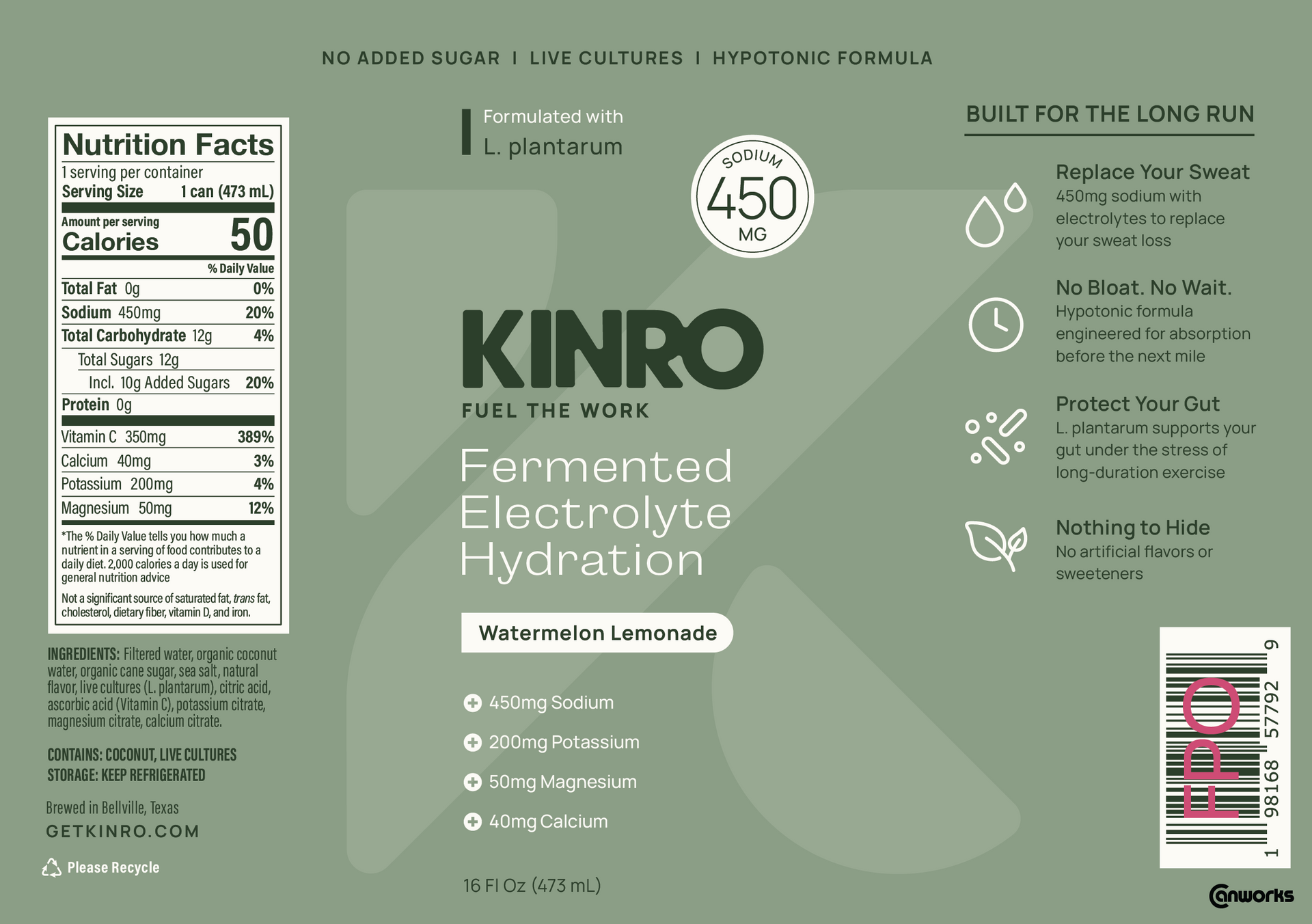
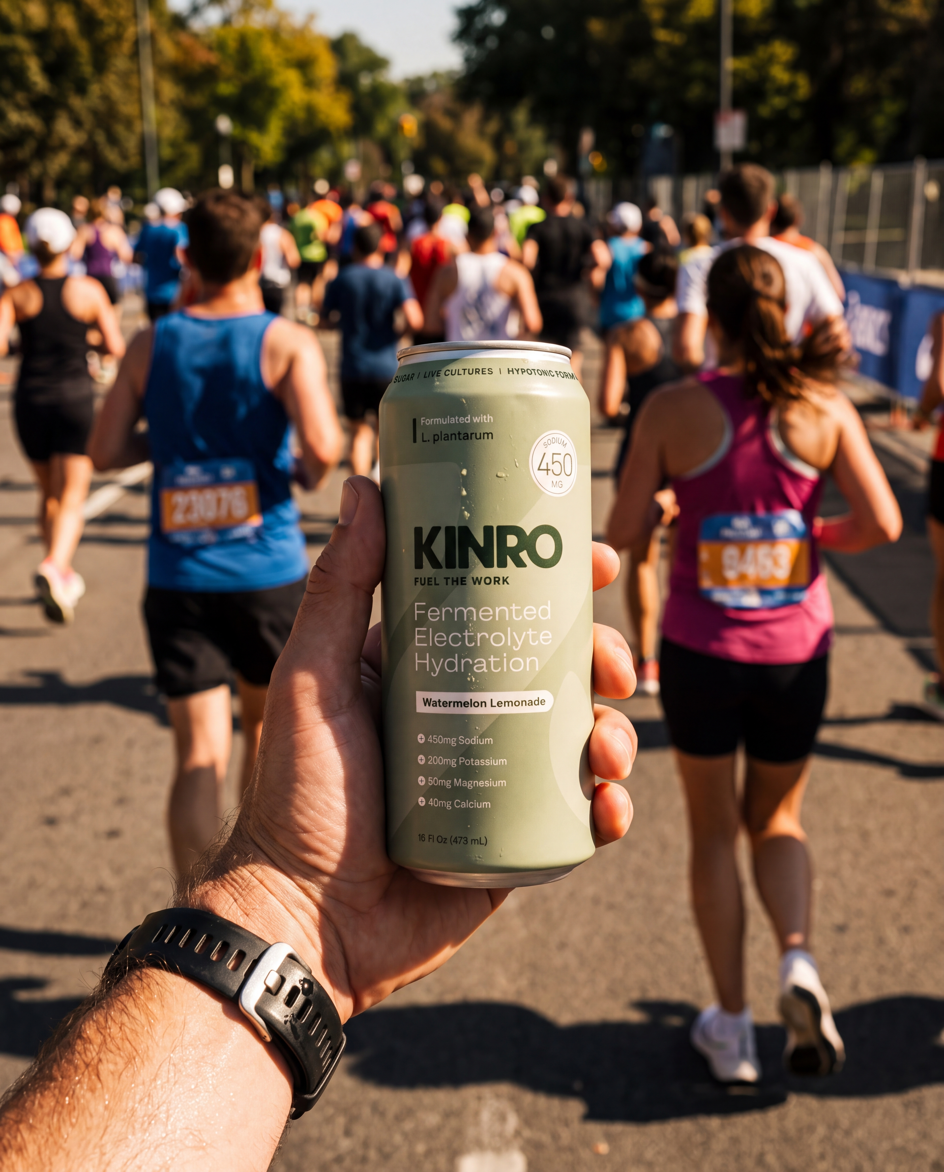
The front panel has to work at a glance, handed off on a trail. The back panel has to work for the athlete who stops to actually read it. Flat label art shown below; final files were produced as full-wrap dielines for a 16 oz sleek can.
structural design
Panel-by-Panel
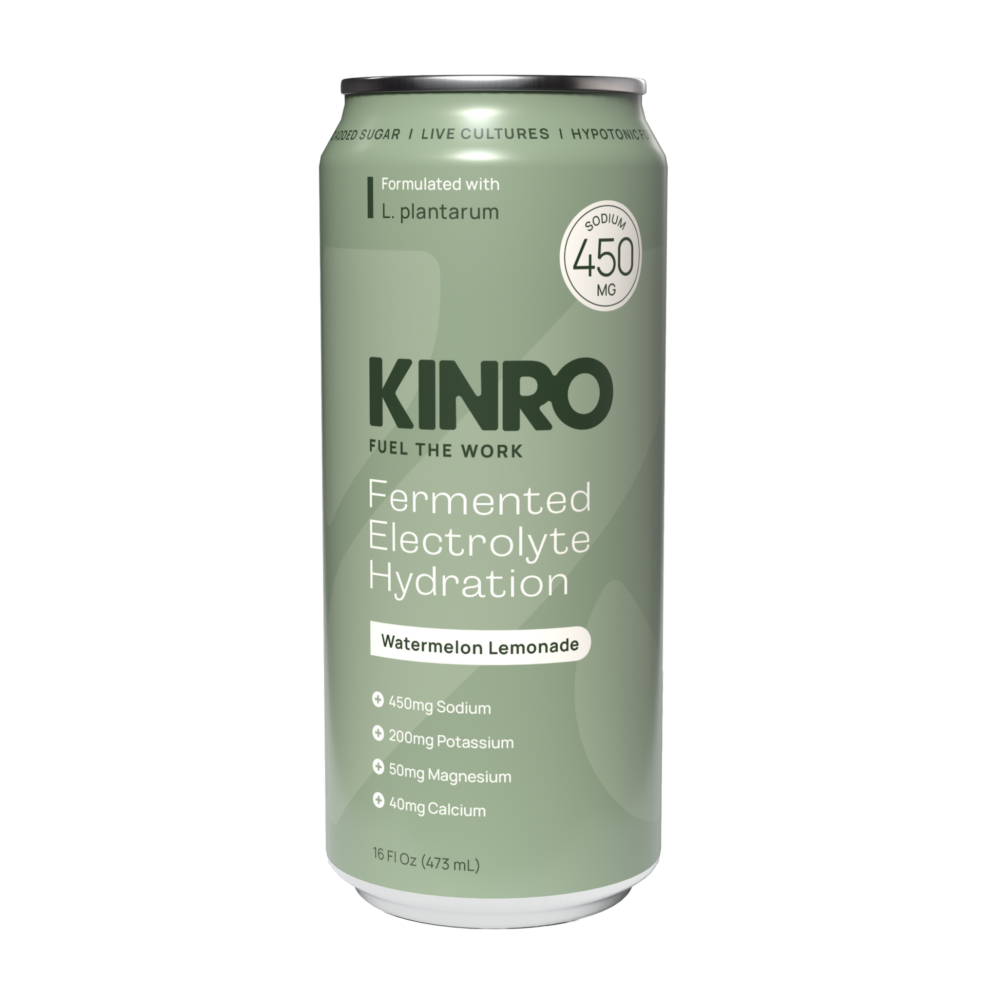
Brand Name
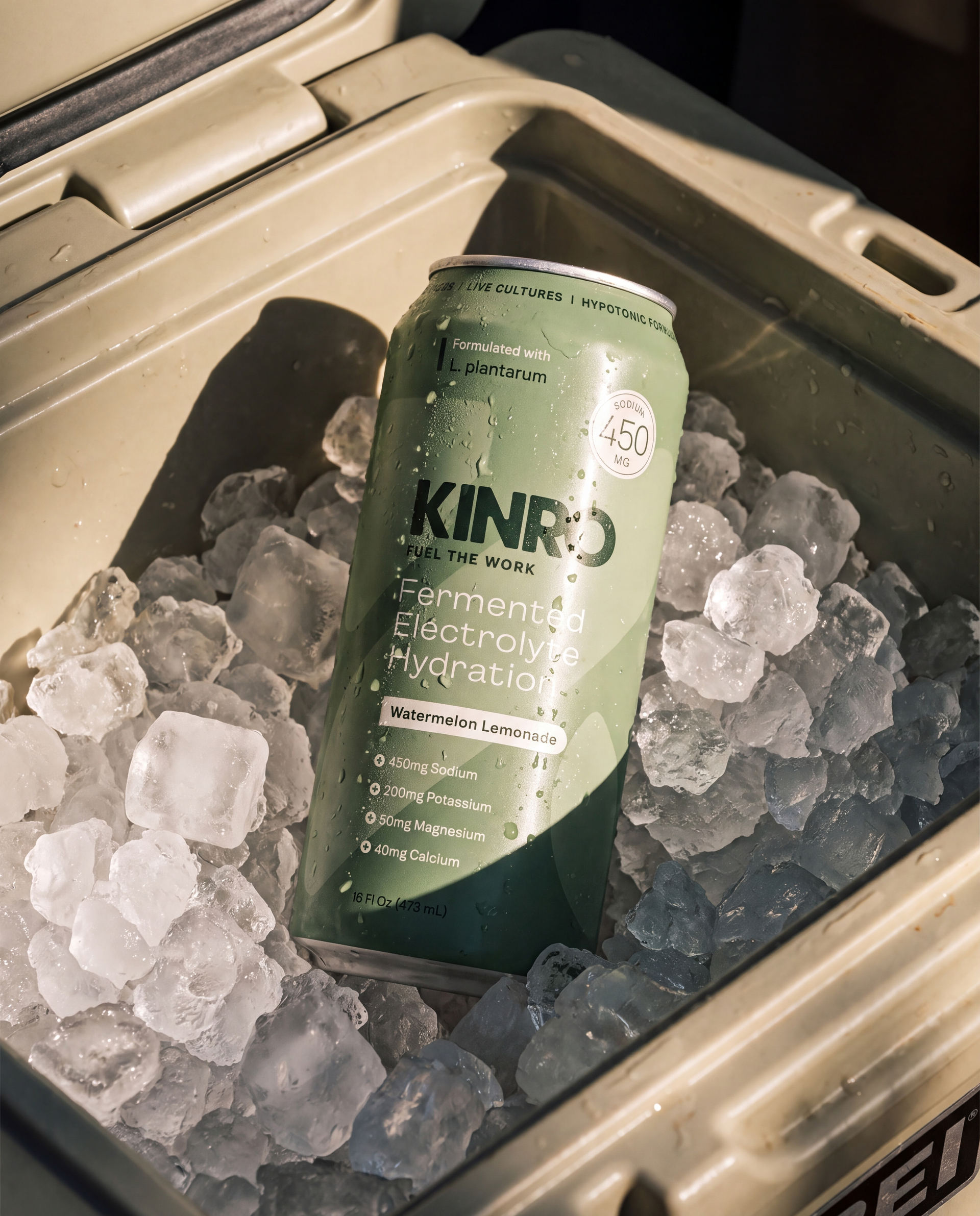
KINRO, dominant and immediate. The logotype has to be the first and last thing read, whether the can is on ice or moving past at a run.
Category Descriptor
"Fermented Electrolyte Hydration" states plainly what's in the can. No metaphor, no category-speak.
Flavor Name
"Fermented Electrolyte Hydration" states plainly what's in the can. No metaphor, no category-speak.
Feature Callouts
Capped at two on the front, per the brief: "Formulated with L. plantarum" and the sodium badge. This audience is skeptical of over-claiming, so the hierarchy stays quiet on purpose.
Net Content
16 FL OZ (473 mL), standard regulatory placement at the base of the panel.
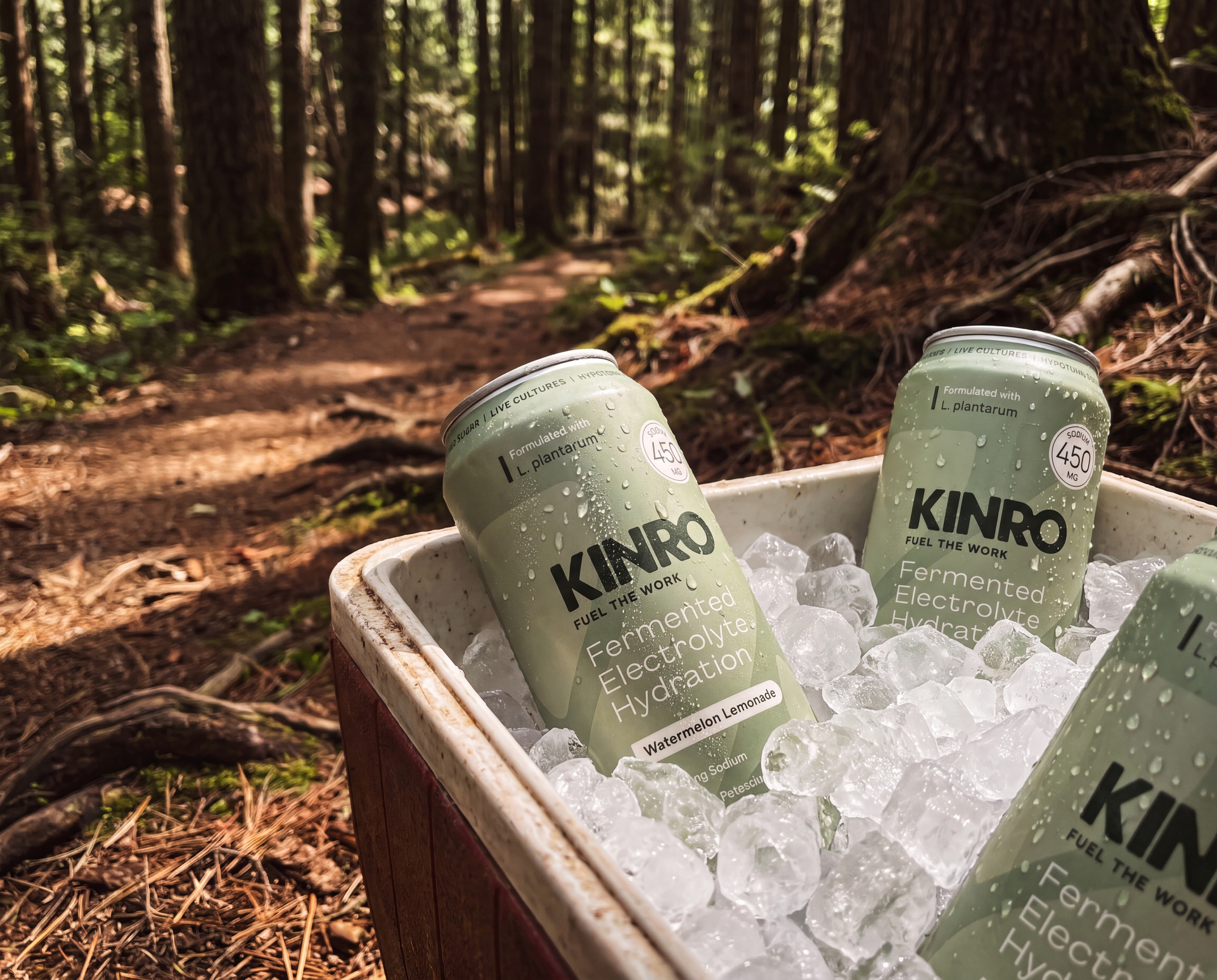
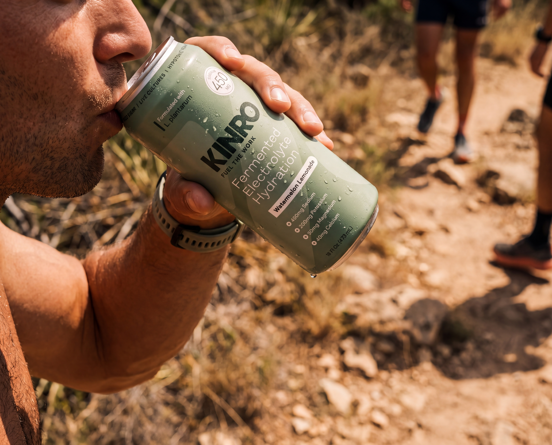
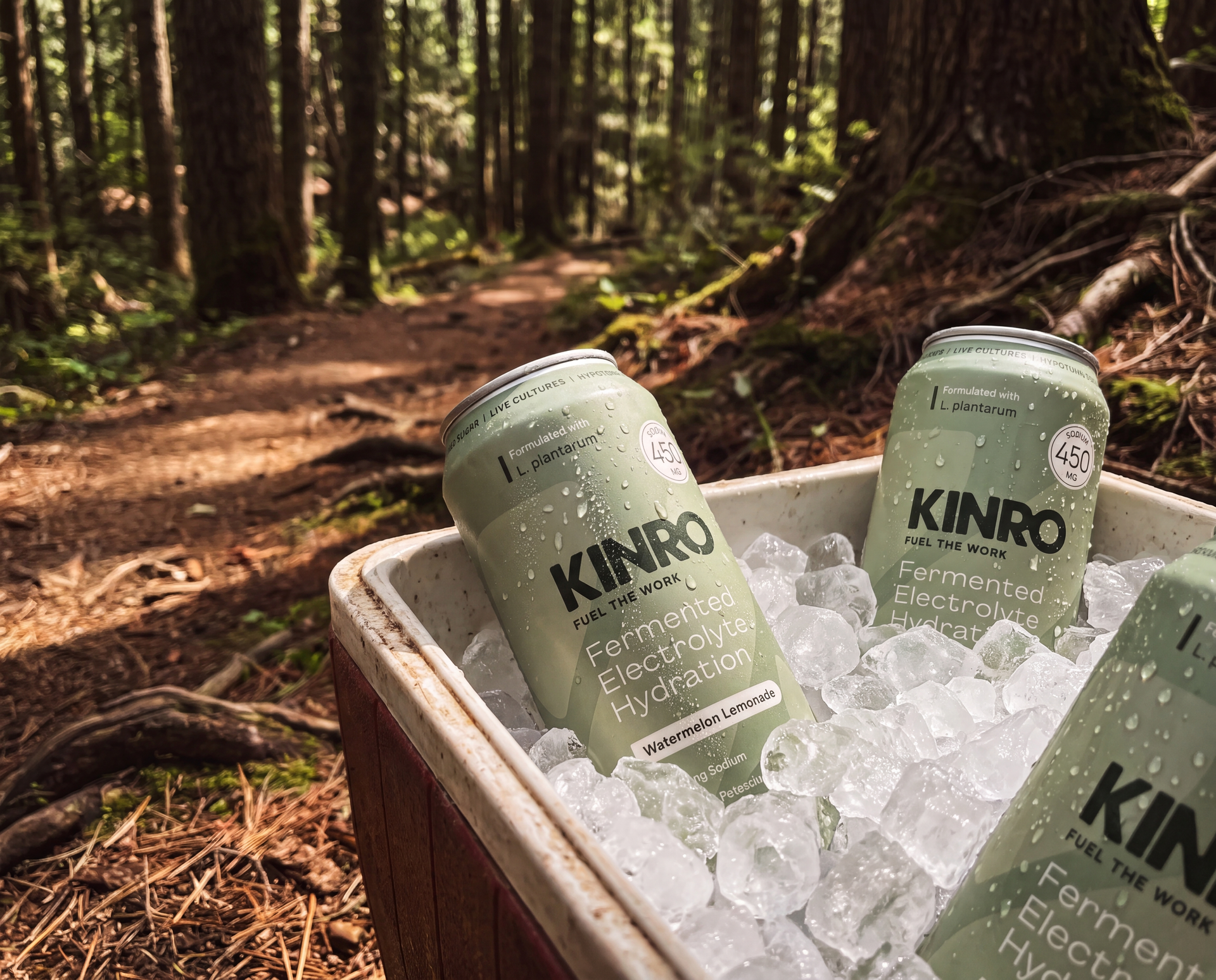
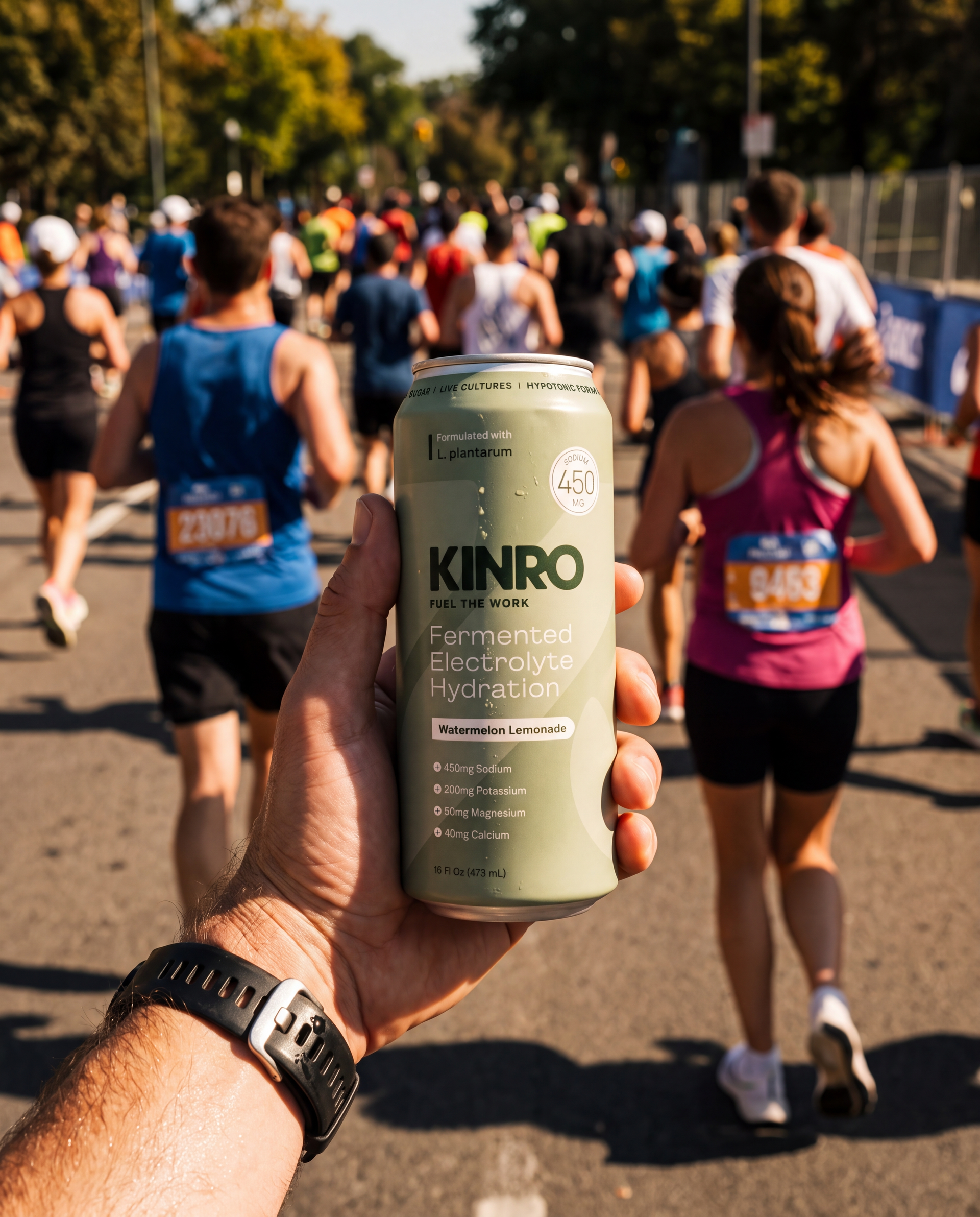
KINRO's real discovery channel isn't a shelf set, it's a handoff: a coach, a pacer, or an aid station volunteer passing a can to someone mid-race. The design had to hold up small, wet, backlit, and iced down, not just under studio lighting.
execution
Built to survive the trail, not just the shelf
Delivered
- Complete brand identity system: logo suite, color palette, typography, brand marks
- Brand standards documentation
- Launch SKU can packaging, front and back panel design
Also Delivered
- Print-ready dielines and 3D packaging renderings
- Social media image kit across platforms
- Full scope, no client-supplied visual assets
OUTCOMES
What Was Delivered