
PACKAGING DESIGN
Homedics
A system-wide packaging overhaul that solved a multi-SKU color problem and elevated HoMedics to a premium wellness shelf presence.
ROLE
Senior Packaging Designer
SCOPE
Full Product Line Rebrand
RETAILERS
Costco, Walmart, Target, & more
PRODUCT
Folding Boxes, Cartons, Labels


Homedics' 2025 packaging used a rich teal-to-dark-navy gradient as its primary system. Against white products, it was striking and premium. But the product line was expanding rapidly, black massagers, colorful thermometers, multi-tone devices, and the teal was starting to fight the products rather than frame them.
The brief: redesign the system to work universally across SKUs, modernize the lifestyle story, and bring hierarchy and consistency back to a line that had grown organically across several design iterations.
Overview
The Brief
THE CHALLENGE
What the teal system couldn't solve
Product color conflicts
Teal read beautifully behind white and ivory product colorways. Black products and anything with orange, red, or blue accents clashed. There was no neutral ground the whole line could share.
Hierarchy buried in gradient
The gradient pulled visual weight toward the background rather than the product name. Lifestyle headlines were competing for the hero position with the product itself.
Benefits hidden
Consumer benefit communication was scattered across bullet points at small sizes. Nothing was scannable at arm's length, a critical failure on a planogram with 4–8 facing SKUs.
Imagery felt generic
Stock photography didn't align with Homedics' wellness positioning. AI-generated lifestyle imagery opened the door to consistent, brand-specific visual storytelling at scale.
Step 01
Competitive audit & system audit
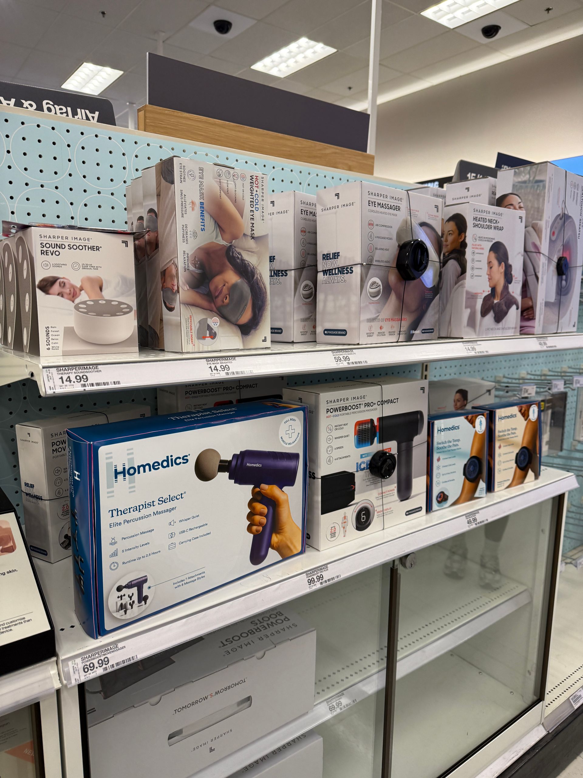
Photographed Homedics product across Target, Walmart, and Costco planograms. Documented where the teal system succeeded and where it broke down against both the product assortment and the competitor shelf set (Sharper Image, Omron, Renpho).
Step 02
Direction exploration
Explored three directions: a continuation of the gradient system with a broader palette, a clean white approach, and a warm cream system. The cream direction emerged as the strongest neutral — it conveyed warmth, approachability, and premium wellness without fighting any product color.
Step 03
Ai lifestyle imagery integration
Used AI image generation to develop a consistent lifestyle photography style — warm interior settings, real-use moments, consistent lighting direction. This gave the team creative control over brand alignment in a way stock photography never could.
Step 04
Mock boxes for retail comparison
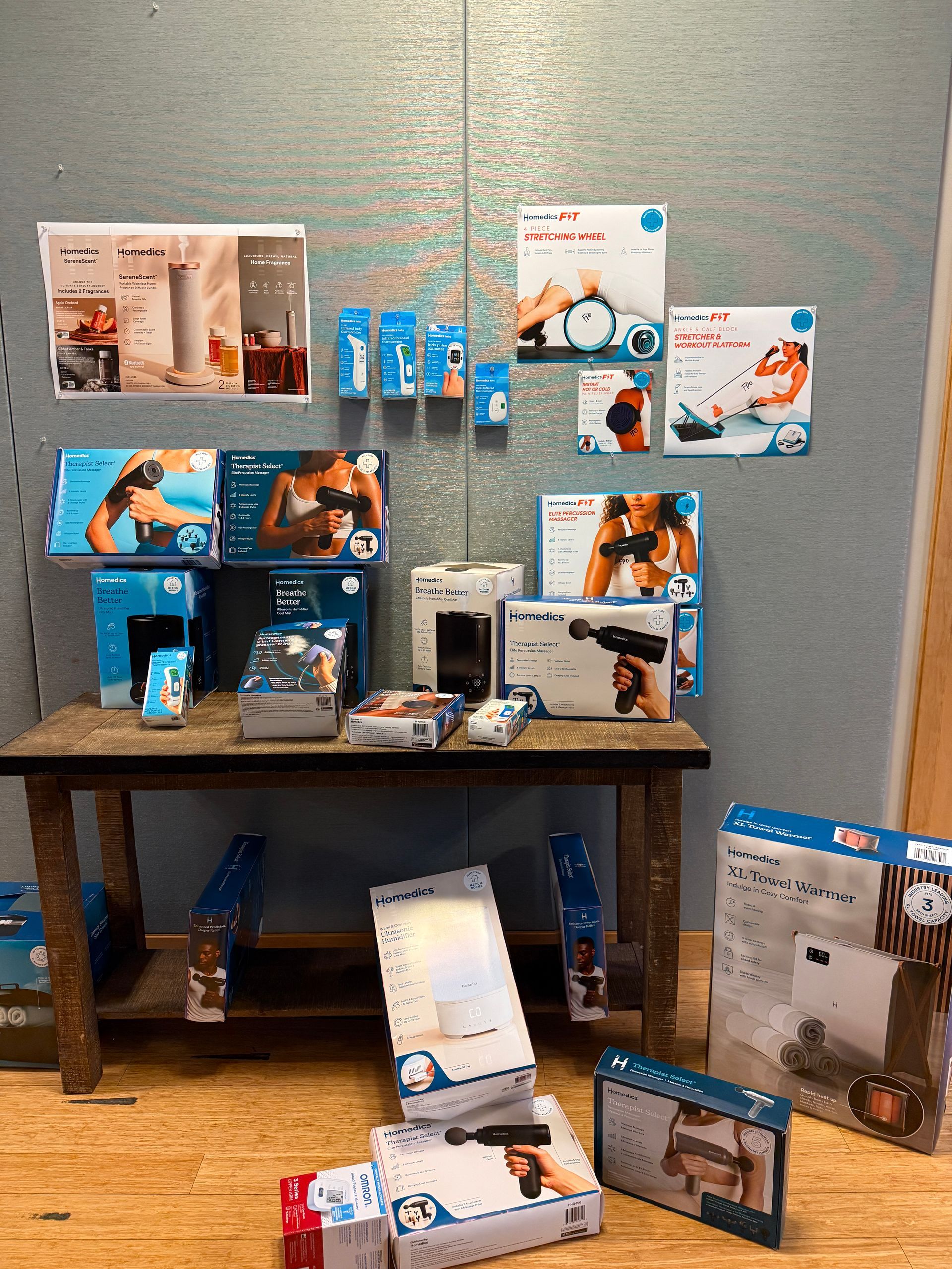
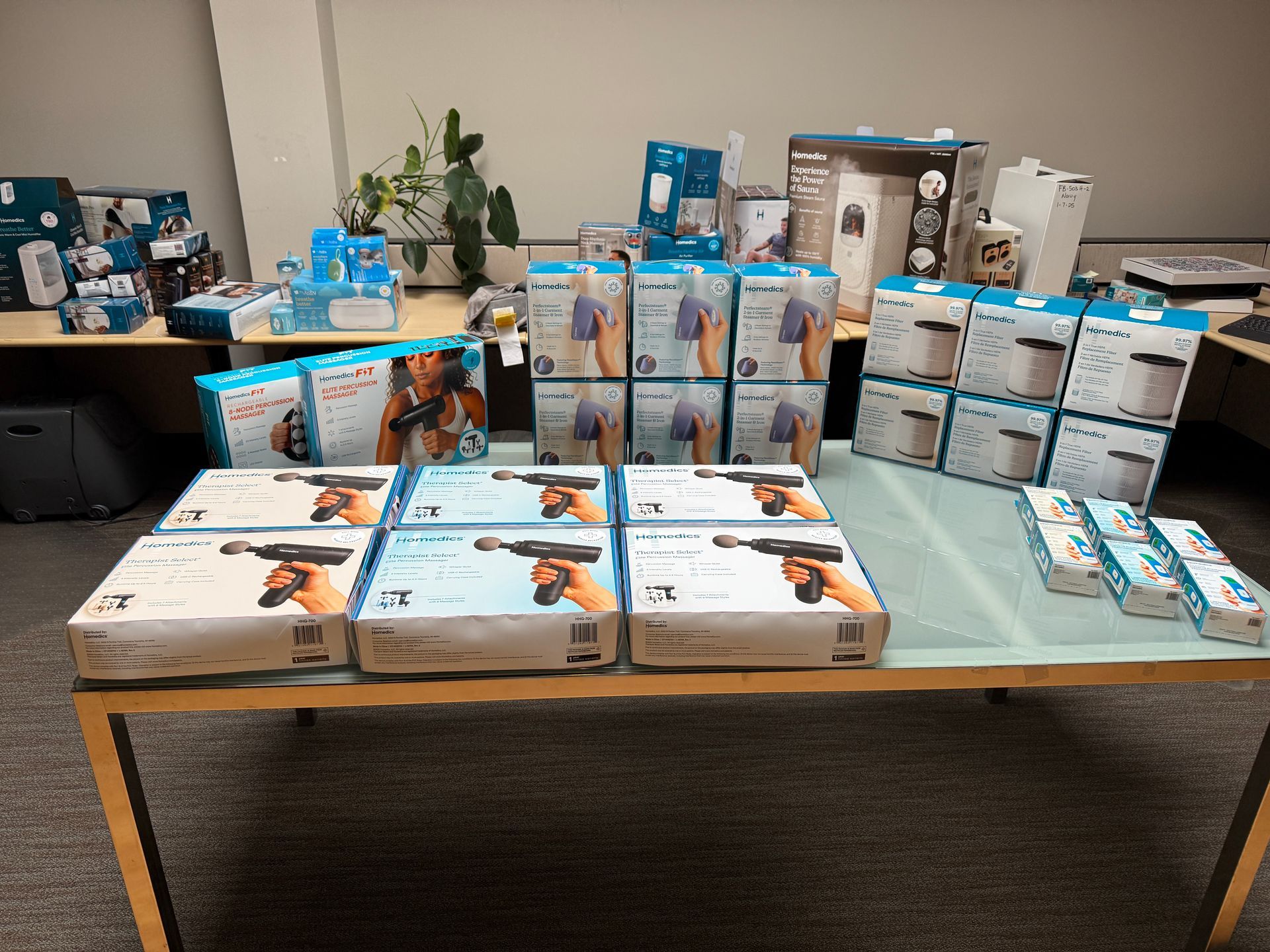
Printed physical mock boxes at full scale and took them directly to Target. Placed them on the actual planogram next to competitors to evaluate shelf presence, readability at distance, and pickup-worthiness. Several iteration rounds came directly from this in-store testing — a crucial step that no screen-based review could replicate.
Step 05
Hierarchy system finalized
Locked the type hierarchy: product name largest, lifestyle claim secondary, benefit section below mid-panel, icon row at base. Cast shadows introduced on white-on-cream products to create visual separation. Dieline templates updated across folding carton, clamshell, and label formats.
THE PROCESS
Brief to retail shelf in iterations
THE CHALLENGE
What the teal system couldn't solve
Previous System
Teal Gradient
- Background: dark teal-to-navy gradient
- Hero element: lifestyle tagline ("Breathe Easy, Anytime, Anywhere")
- Product name: secondary weight, smaller than headline
- Benefits: small-scale bullet list with icons
- Lifestyle: generic stock photography
- Works well: white products only
- Breaks down: black, orange, multi-color SKUs
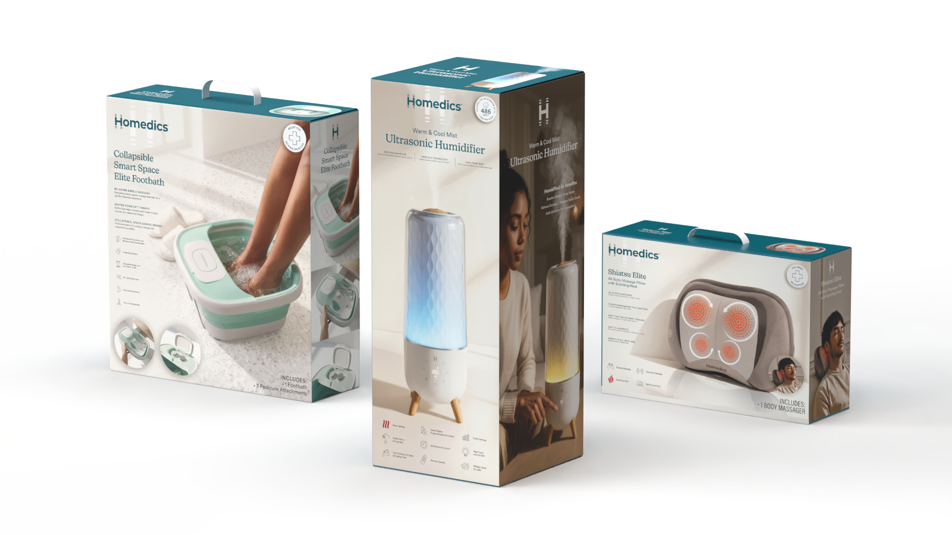
REDESIGNED SYSTEM
Cream lifestyle
- Background: warm cream — universal neutral
- Hero element: product name, largest type on panel
- Lifestyle claim: supporting line, secondary hierarchy
- Benefits: 3-blurb section, scannable at shelf distance
- Lifestyle: AI-generated, brand-consistent imagery
- Works well: every product color in the line
- Cast shadows: white products separate from cream field
"The teal looked great. It just looked great for one product. The cream works for all of them — and it let the product itself finally become the hero."
On the core strategic insight driving the system shift

The cream lifestyle system gave Homedics a packaging architecture that works across its full product assortment, from compact personal care devices to large home wellness appliances. The three-blurb benefit structure became a template applied across all new launches, and the AI imagery approach reduced lifestyle photography production time significantly.
In the Target shelf test, the new packaging read as premium against Sharper Image and distinctly warmer and more approachable than a clinical aesthetic, landing the brand in the right competitive position.
the result
A System that Scales