packaging design
Hard Mule Seltzer
Building a suite of hard seltzer products from the can to the case and beyond.
ROLE
Packaging Designer
SCOPE
Label Redesign
Multi-pack Boxes
CATEGORY
Alcohol
PRODUCT
Moscow Mule Hard Seltzer Lin
Hard Mule Seltzer Co. licenses the Moscow Mule name, the cocktail born at the Cock 'n' Bull Pub in Hollywood in 1941, for a canned hard seltzer line. The brand identity, name, and core mark were already established and supplied by the client, so my work started at the packaging level.
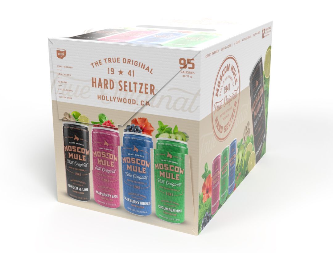
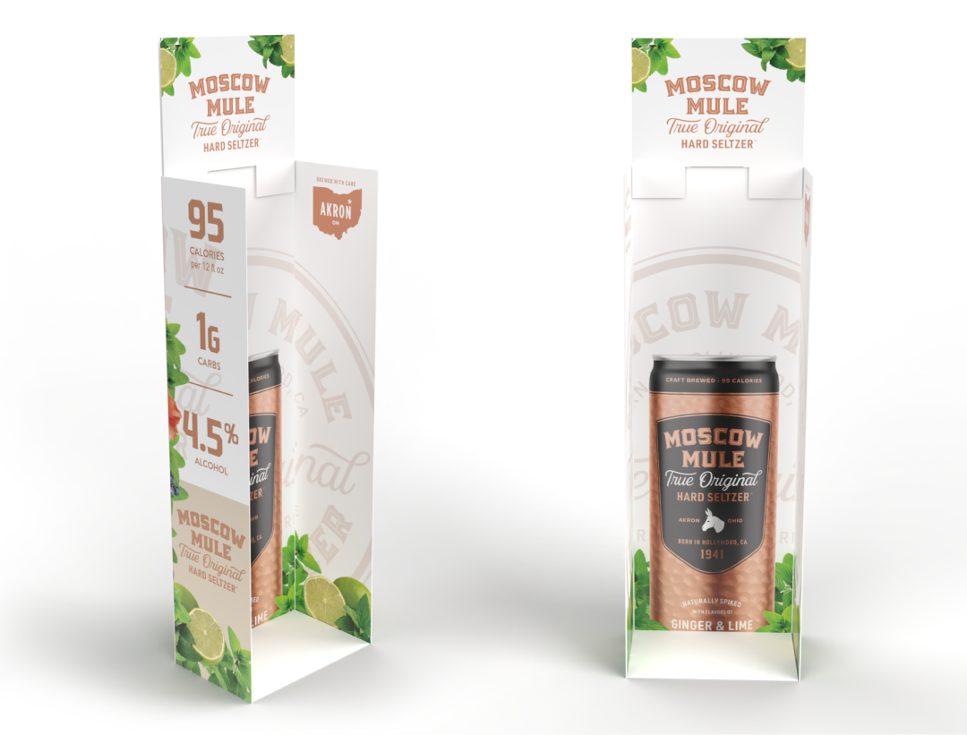
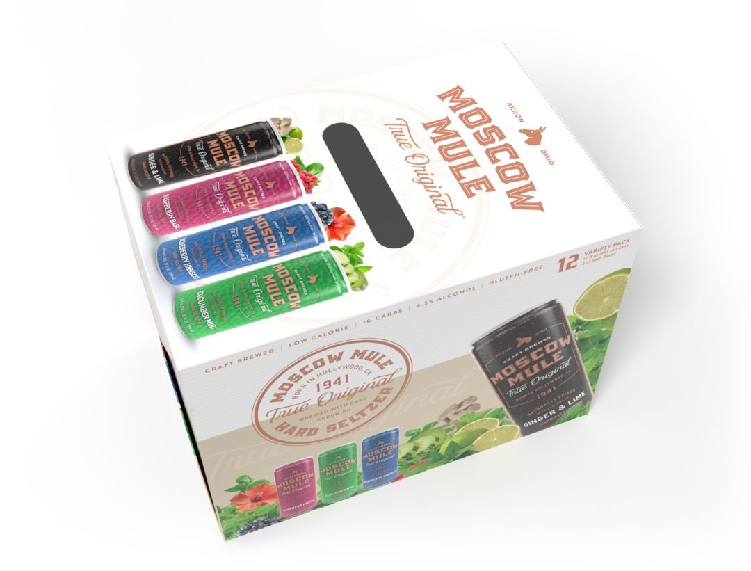
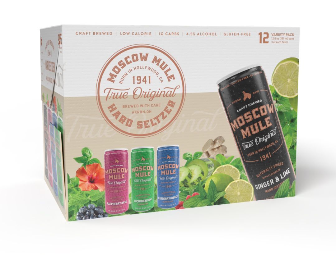
The assignment was to take the brand asses and turn them into label artwork across five flavors and two ABV tiers, and engineer the entire physical system around it: three can volumes, a 12- and 15-pack variety carton, single-flavor 4-packs, and a corrugated floor display, all built so the line reads as one coherent family from the loading dock to the shelf.
Scope note: the Moscow Mule wordmark, copper seal, and donkey icon were provided by the client and licensor and are not part of this body of work. My contribution covers structural packaging engineering, format extension, case and carton layout, panel composition, and retail display design.
Overview
The Brief
Three pillars
Working Principles
The mark travels, the structure flexes.
The seal, wordmark, and donkey icon stay fixed in proportion and placement logic across every substrate. What changes is everything underneath them, panel width, fold count, ply, to fit the format, never the other way around.
Color does the sorting.
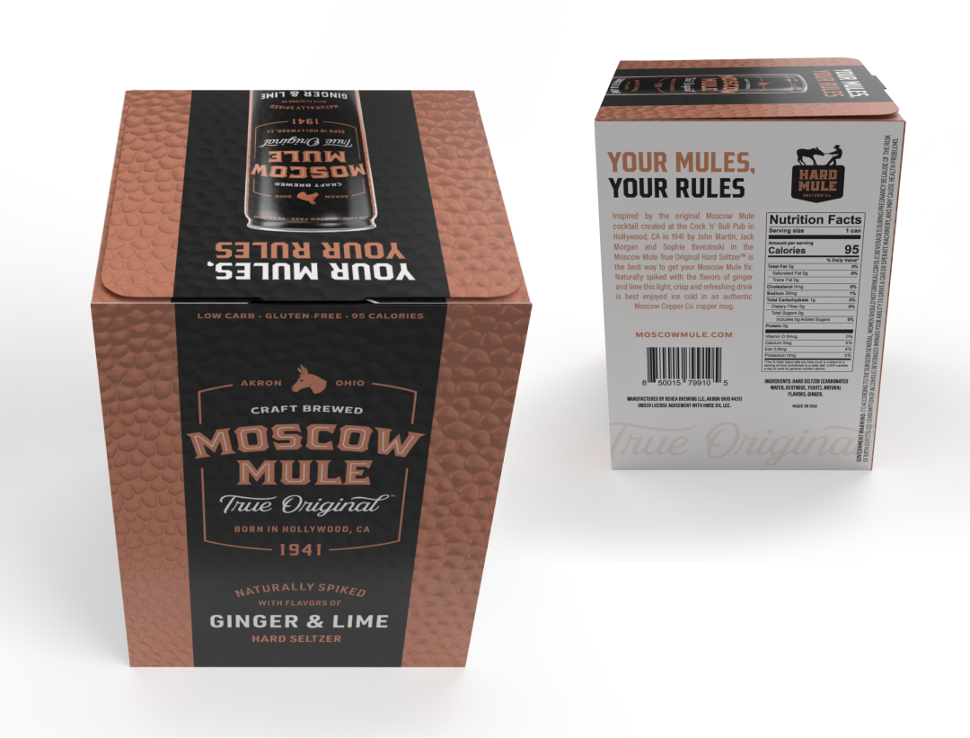
With one wordmark repeating five times across a shelf, flavor coding had to carry the full weight of differentiation, so can body color, garnish photography, and carton flavor strip all reinforce the same five-color key.
Formatted to scale.
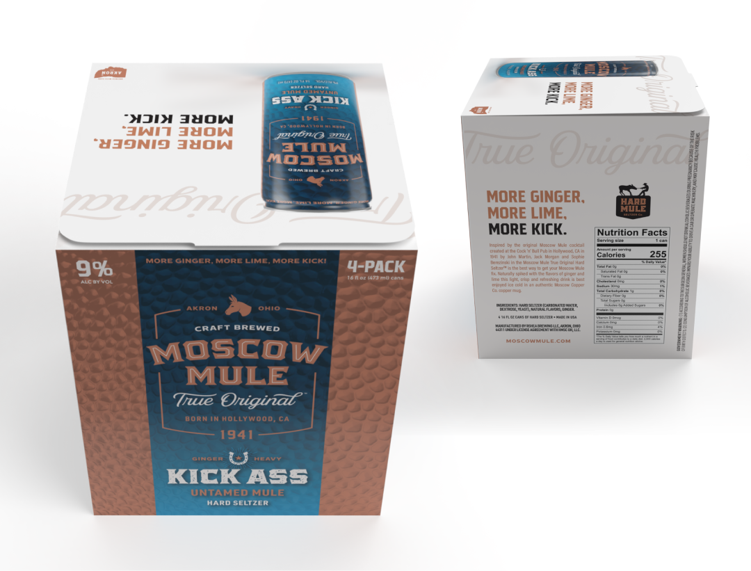
Format, finish, and copy step up together: taller cans, a deeper copper-to-denim gradient, and bolder claim language signal the heavier pour before anyone reads the ABV line.
COLOR + TYPE
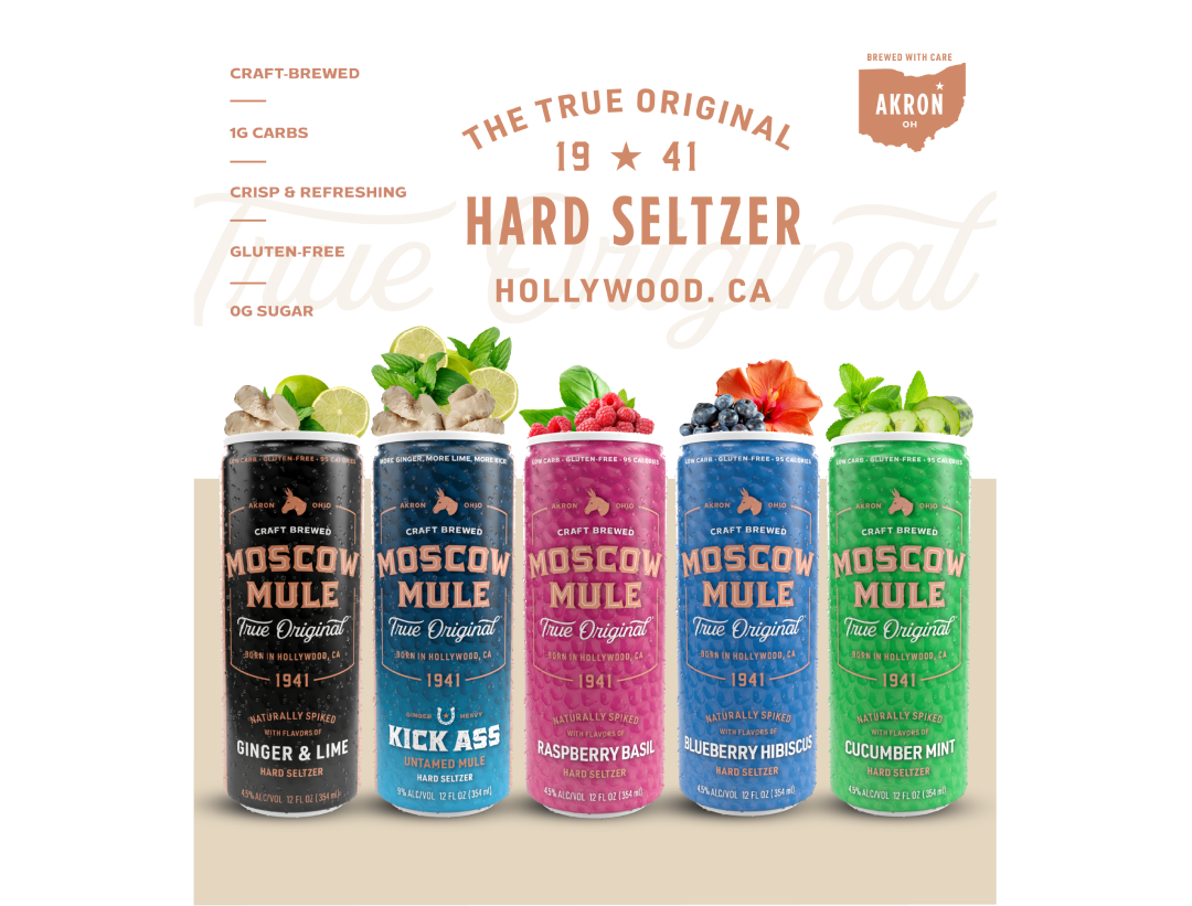
Flavor Color Architecture
Five flavors needed to read as a family while still standing apart on shelf: Ginger & Lime on a black background, Kick Ass on a copper-to-denim gradient, Raspberry Basil on magenta, Blueberry Hibiscus on denim, and Cucumber Mint on green. Every can, regardless of body color, carries the same hammered-copper texture overlay, a direct nod to the copper mug the cocktail is traditionally served in. It's the one constant beneath five different colorways, and it's what makes the lineup read as variations on a theme rather than five unrelated SKUs. Real ginger, lime, raspberry, hibiscus, and cucumber sit on top of each carton's flavor key. It's a small system decision with an outsized effect: shoppers scanning fast get a visual flavor cue before they read a single word of copy.

The finished system covers six packaging structures: three can heights, the twelve-pack carton, two single-flavor four-packs, and the floor display. Five flavor SKUs are unified under one color-coded system without altering the licensed brand mark, across twelve carton panels spanning front, side, rear, and header treatments. Two ABV tiers are visually distinguished through finish, gradient, and copy weight alone.
THE BRAND
Scaling Formats