
Branding & PACKAGING
Canton Water Co.
Building a single-source artesian water brand from the ground up — name, mark, and label — rooted in the place it comes from.

ROLE
Full brand identity + label design
SCOPE
Branding + Packaging
CATEGORY
Beverage / single-source water
PRODUCT
Naming direction
Logo
Label system
The client came to me with an artesian water sourced from a local spring and a strong point of view on feel, rustic but clean, unmistakably Texan, but no name and no mark yet. The product itself had a real story: a historic local spring with decades of use behind it. The brand needed to carry that story without leaning on grunge textures or heavy illustration to get there.
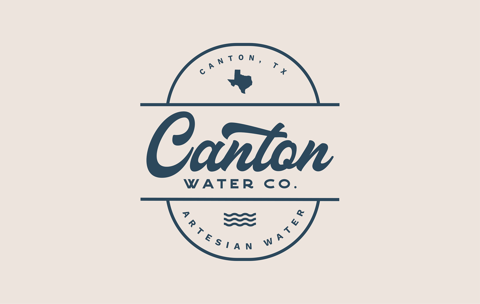
My first move was naming. Rather than inventing something abstract, I suggested naming the water after the place it comes from, a strategy that builds in regional pride and gives the label an honest, single-source claim from the start. That became Canton Water Co., shortened to "Co." on the mark itself.
From there, the brief was really a typography and color problem: find a visual language that felt like classic Texas signage, hold it to two colors, and let the structure of the badge do the storytelling instead of imagery.
Overview
The Brief

What the Brand Needed to Do
- Read as local and single-source at a glance
- Feel rustic without slipping into kitsch or grunge
- Work in one ink color for cost-efficient print
- Hold up small, on a bottle, across formats
Three pillars
The References that Shaped the Mark
Vintage Dallas Signage
The interlocking script of the wordmark draws directly from the neon-lit, hand-painted signs of '50s and '60s Dallas — a personal, childhood reference point for the kind of confident, looping script that reads as classic Americana rather than novelty.
Place Over Product
Texas appears twice in the badge as the state outline and the "Canton, TX" arc, a deliberate redundancy that rewards the local-first shopper without needing a second look. Provenance is the headline, not a footnote.
Restraint as a strategy
One ink color, one script, one symbol. No grunge texture, no photographic well imagery. The wavy line is the only literal reference to water. Everything else is structure, type, and a badge format doing the work that imagery usually does.
COLOR + TYPE
Navy, cream, and a script with some swagger
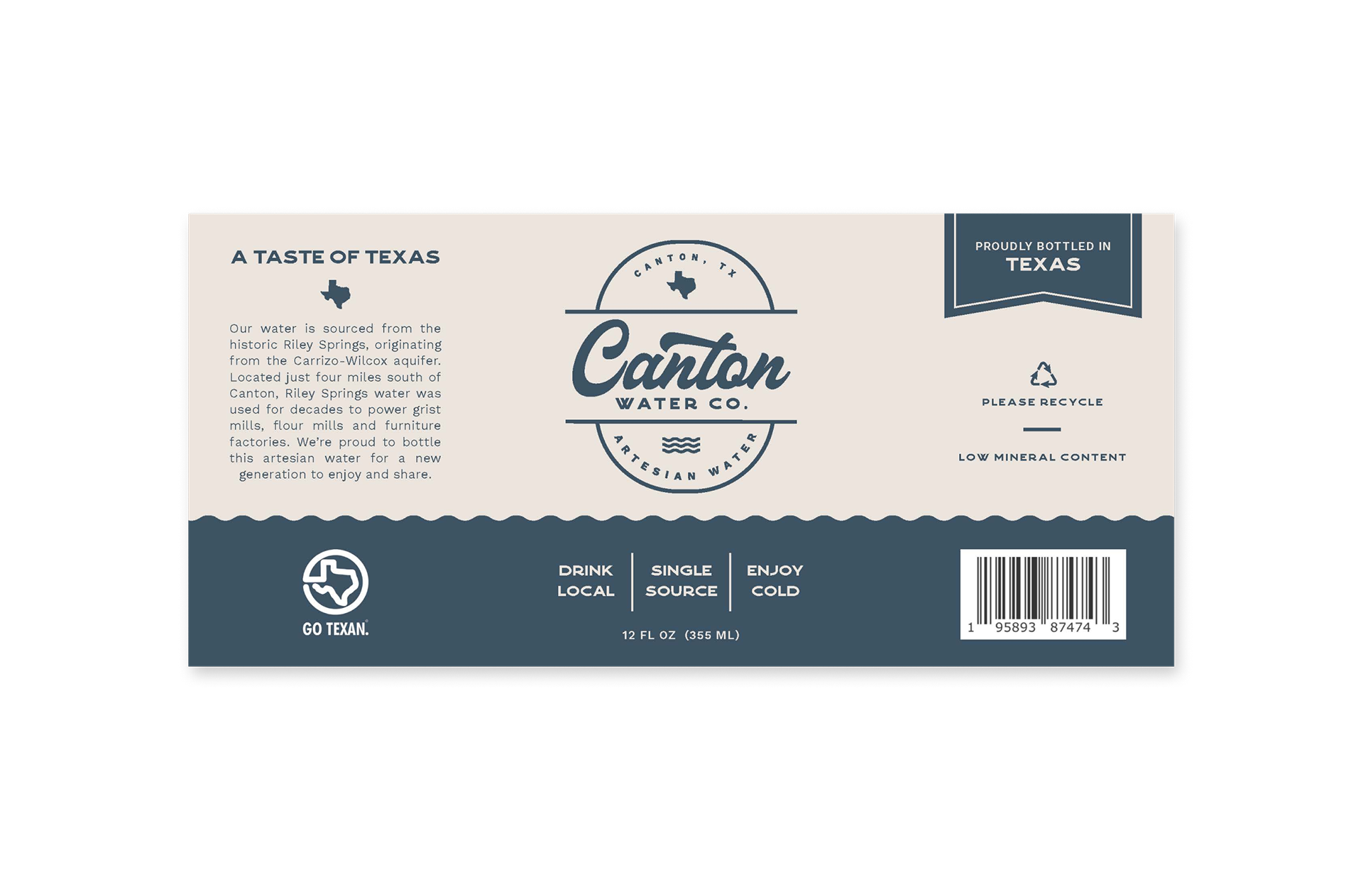
Navy was the obvious read for water before it was anything else, but it does double duty. The same blue carries an echo of denim, a quiet nod to the cowboy culture wrapped up in the brand's Texas identity. Printed in a single ink on uncoated cream stock, it keeps production simple and the result feels closer to a feed-store sign than a beverage label. The label runs almost entirely monochromatic navy on cream, full stop. No secondary palette, no gradient, no photographic texture standing in for craft. The discipline is the point: it's what lets a script-heavy, detail-dense badge stay legible instead of busy.
Canton navy
#1F3F52
Label cream
#EFE6D8
A connected, lowercase-leaning script for the name, paired with a squared, wide-set sans for "Water Co." and the arcing copy above and below. The contrast — loose script against rigid block type — is what gives the badge its vintage-sign rhythm rather than a generic circular logo feel.
THE BRAND
The Logomark
Panel-by-panel breakdown
The Label
The badge
"Canton, TX" arcs over a Texas state mark; "Artesian Water" arcs beneath a wavy water glyph. The script wordmark sits dead center, on the one horizontal axis that splits the badge top and bottom — the same split used across every format.
The wave band
A torn, hand-cut edge separates the cream badge field from the solid navy base panel — the only textural gesture on the whole label, and it's structural, not decorative. It reads as a literal waterline.
Brand promise line
"Drink local / Single source / Enjoy cold" — three short claims set in the same bold sans as the badge, doing the job a tagline usually would, without adding a new typeface to the system.
Back-of-label story
The back panel names the actual source — Riley Springs, four miles south of Canton, drawing from the Carrizo-Wilcox aquifer — and its working history, alongside a Go Texan mark, recycling note, and standard regulatory information.
