PACKAGING DESIGN
BeeFuel
Label design for a honey-based sports drink launching in three flavors built to own the shelf in the natural performance segment.
Deliverables
Label Design (3 SKUs)
SCOPE
Label Design
FORMAT
Custom Dieline
3D Renders
CATEGORY
Sports / Functional Beverage
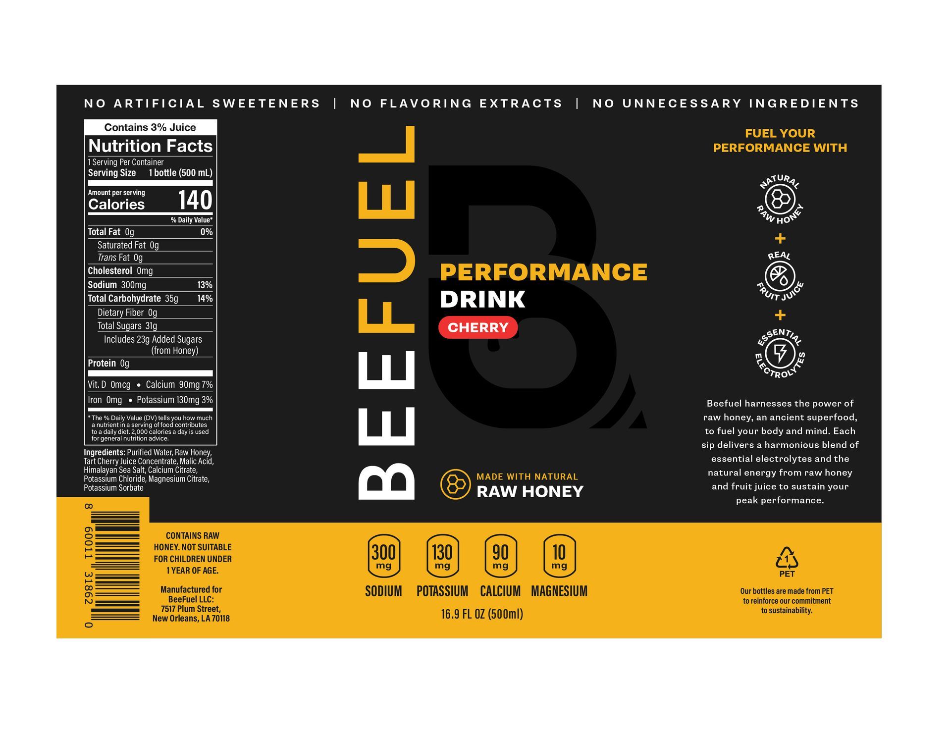
BeeFuel is a honey-based performance drink going up against synthetic electrolyte brands. The client came in with a logo and a product story about raw honey as a naturally sourced energy and hydration ingredient, paired with essential electrolytes , and needed label design that could bring it to life on a 16.9 oz PET bottle.
The challenge: carve out distinct shelf presence in a crowded, neon-heavy sports drink category, while signaling clean ingredients and genuine athletic performance credentials.
Note: The BeeFuel wordmark and icon were supplied by the client. All label layout, typography, color system, information hierarchy, and brand language were developed as original design work.
Overview
The Brief
"Every single person I've shown your art to has been blown away and super complementary. Thanks again for your work and expertise. This project feels like my baby, I've spent the last 9 months focused solely on this. The label is the first thing consumers will see, and you created something even better than I was imagining."
– Chris, BeeFuel Founder
DESIGN STRATEGY
Three Pillars
01
Instant Recognition
The sports drink aisle is dominated by bright synthetic colors and aggressive typography. BeeFuel needed a look that felt different without feeling out of place.
02
Utility Clarity
Electrolyte content is a functional purchase driver. Rather than burying those numbers in the Nutrition Facts, the design surfaces them as a designed callout strip featuring four minerals, each with its mg value, readable at arm's length.
03
Ingredient Story
Raw honey is an ancient superfood with real performance science behind it. The back panel uses a three-badge system and a short narrative to give the curious shopper a reason to commit.
VISUAL IDENTITY
Color + Type
The visual system was built around two colors and one display typeface — enough to be distinctive, simple enough to extend across three SKUs without variation fatigue.
Matte Black
#1A1A1A
Amber Gold
#F5F5F2
Supria Sans
The primary display typeface. Bold and definitive declaration of name and ingredients.
Roboto
Used for body copy, feature callouts, and instructional text. Keeps utility information readable and distinct from the display headlines.
A cylindrical bottle label is a continuous surface with distinct zones. Each panel was designed with a specific job.
structural design
Panel-by-Panel
Left Panel
Regulatory and nutrition information
The Nutrition Facts panel and full ingredient list occupy the right half of the back. Flavor-specific details appear in the ingredients, grounding the flavor claims in real fruit sourcing.
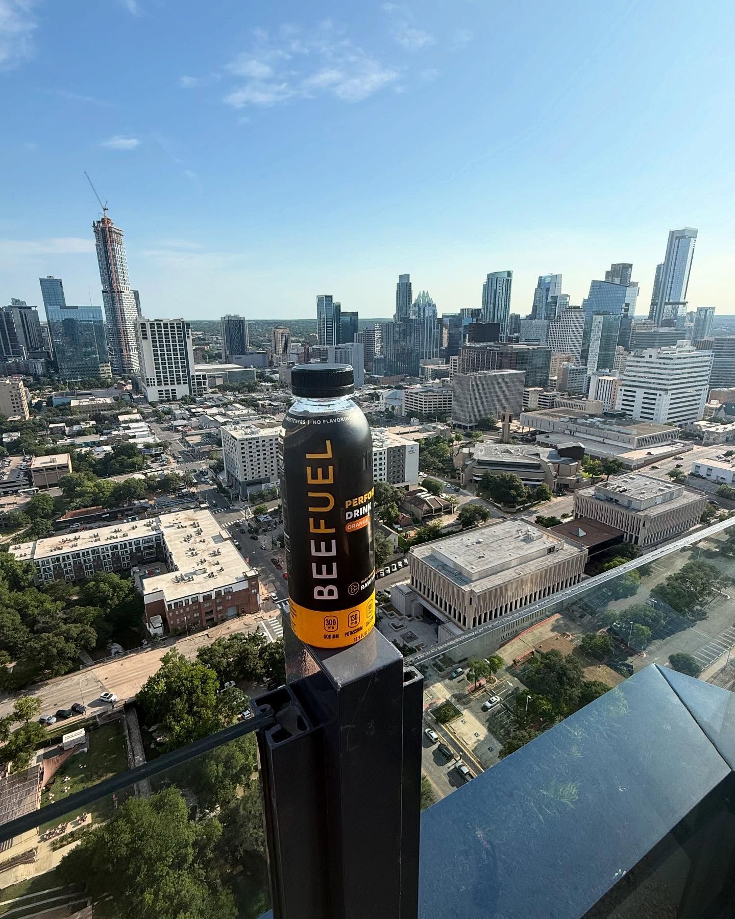
Front Panel
The primary purchase trigger. The vertical BEFUEL wordmark runs the full height of the label for maximum shelf impact. "Performance Drink" establishes category, and the flavor pill (the only element that changes across SKUs) provides instant differentiation. The large ghosted "B" icon adds depth without competing with the hierarchy.
Right panel
Brand story and ingredient pillars
Three circular badges stack vertically as a visual shorthand for the product philosophy. Below them, a short brand narrative expands on the honey-as-superfood story for the shopper who flips the bottle before buying.
Electrolyte Strip
Functional credentials at a glance
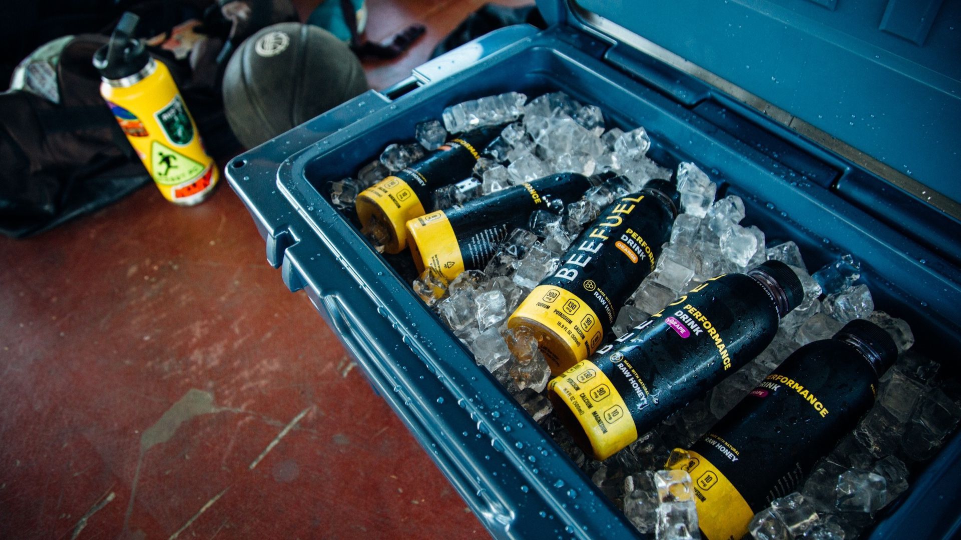
The amber base strip at the bottom of the front panel converts the electrolyte disclosure into a designed feature. Four mineral badges (Sodium 300mg, Potassium 130mg, Calcium 90mg, Magnesium 10mg) are displayed as icon-paired values — readable at arm's length and more compelling than a footnote in the Nutrition Facts.
Base Panel
Compliance and sustainability
The PET recycling indicator, barcode, manufacturer address, and allergen statement anchor the bottom of the back label. The amber base band carries through from the front, maintaining visual continuity across the full 360° wrap.
Raw Honey Callout
Positioned above the electrolyte strip, the "Made with Natural Raw Honey" badge with its honeycomb icon anchors the brand's core differentiator on the front panel. It answers the first question a performance-conscious shopper asks: what's actually in this?
The label system was delivered in two formats: production-ready flat files for print/manufacturing, and photorealistic 3D bottle mockups for brand and retail presentation.
Delivering both formats is a commercial value-add — the flat files go directly into manufacturing, while the 3D renders compress the timeline from design approval to retail presentation, removing the bottleneck of waiting for physical prototypes.
execution
Dieline to 3D
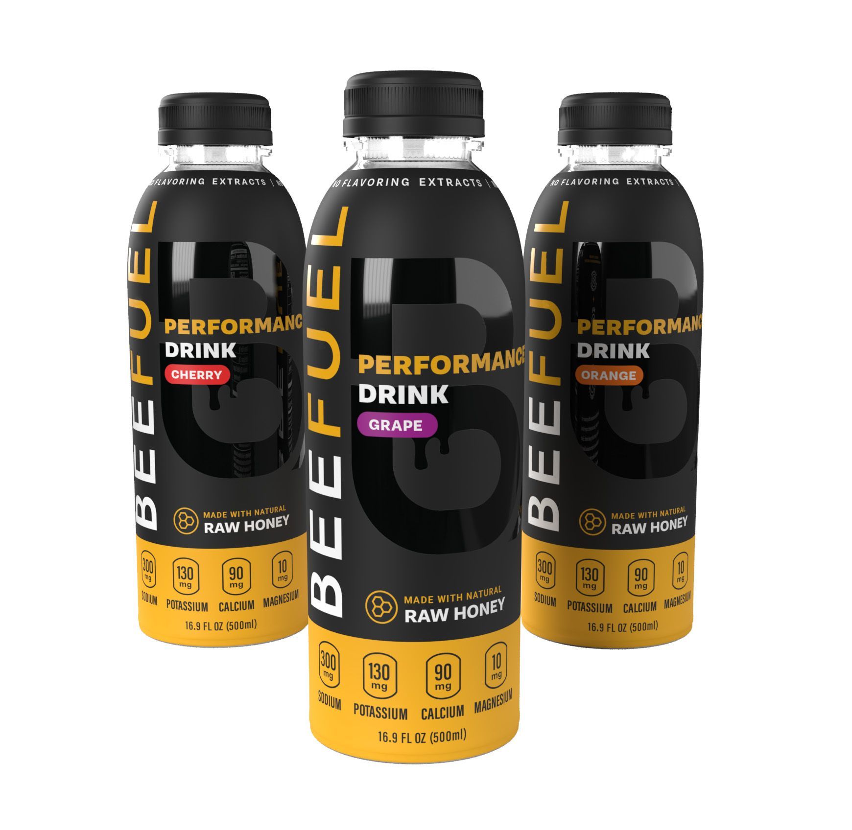
- 3-SKU label system: Front and back label artwork for Cherry, Grape, and Orange — all production-ready, all extending from a single unified design architecture.
- Scalable flavor system: The flavor pill model creates a cleaIndividual and lineup bottle renders for each SKU, delivered for use in sales, pitch, and marketing materials.
- Retail-ready 3D renders:
Individual and lineup bottle renders for each SKU, delivered for use in sales, pitch, and marketing materials.
OUTCOMES
What Was Delivered